Brecht De Ruyte's site redesign is this week's featured story and a masterclass in progressive enhancement: squircles via corner-shape, cross-document view… Compiled for immediate developer deployment.
calendar_todaysummarizeWeek 10-2026
article
TAG: DEEP DIVEREAD_TIME: 15_MIN
Putting my money where my mouth is: a redesign built on progressive enhancement | utilitybend
Brecht De Ruyte rebuilt his personal site as a living proof-of-concept for progressive enhancement, layering corner-shape squircles, cross-document view transitions with :active-view-transition-type() direction awareness, @property-driven hue-shifting scroll orbs, and a no-JS anchor-positioning nav pill — all behind @supports checks and without a single polyfill. The type scale uses clamp()-based fluid sizing with custom tokens such as --s-font-size-base and --s-font-size-h1, while the color palette moves from SCSS variables to oklch and color-mix() in plain CSS with cascade layers (@layer vendor, tokens, reset, base, atoms, molecules, organisms, pages, utilities). Scroll-state queries power the sticky header shadow and hide/reveal behavior without Intersection Observer, and animation-timeline: scroll(root) drives a reading progress bar visible only on pages containing .article-body. The enhanced attr() syntax resolves view-transition-name values directly from data-vt HTML attributes, a pattern that is part of Interop 2026. CSS-only carousels using ::scroll-button() and scroll-state(scrollable) replace JavaScript-driven photo and Bluesky-feed strips.
This concise reference covers every filter function accepted by backdrop-filter — blur(), brightness(), contrast(), grayscale(), hue-rotate(), invert(), saturate(), sepia(), opacity(), and drop-shadow() — and explains the critical ordering rule: filters are applied sequentially left to right, so brightness then contrast produces a different result than contrast then brightness. The guide also documents current browser-support gaps: opacity() is reliable only in Firefox Nightly and is silently ignored by Chrome, Edge, and Safari, while drop-shadow() shares the same limited availability. For production glassmorphism effects, the safe cross-browser stack is blur() paired with brightness(), contrast(), or grayscale(). A semi-transparent background is a practical requirement for the effect to be visible, though the author frames this as a useful design constraint rather than a limitation.
CSS Generator for Fancy Frames (Squiggly, Ragged, Wavy, Torn, etc.)
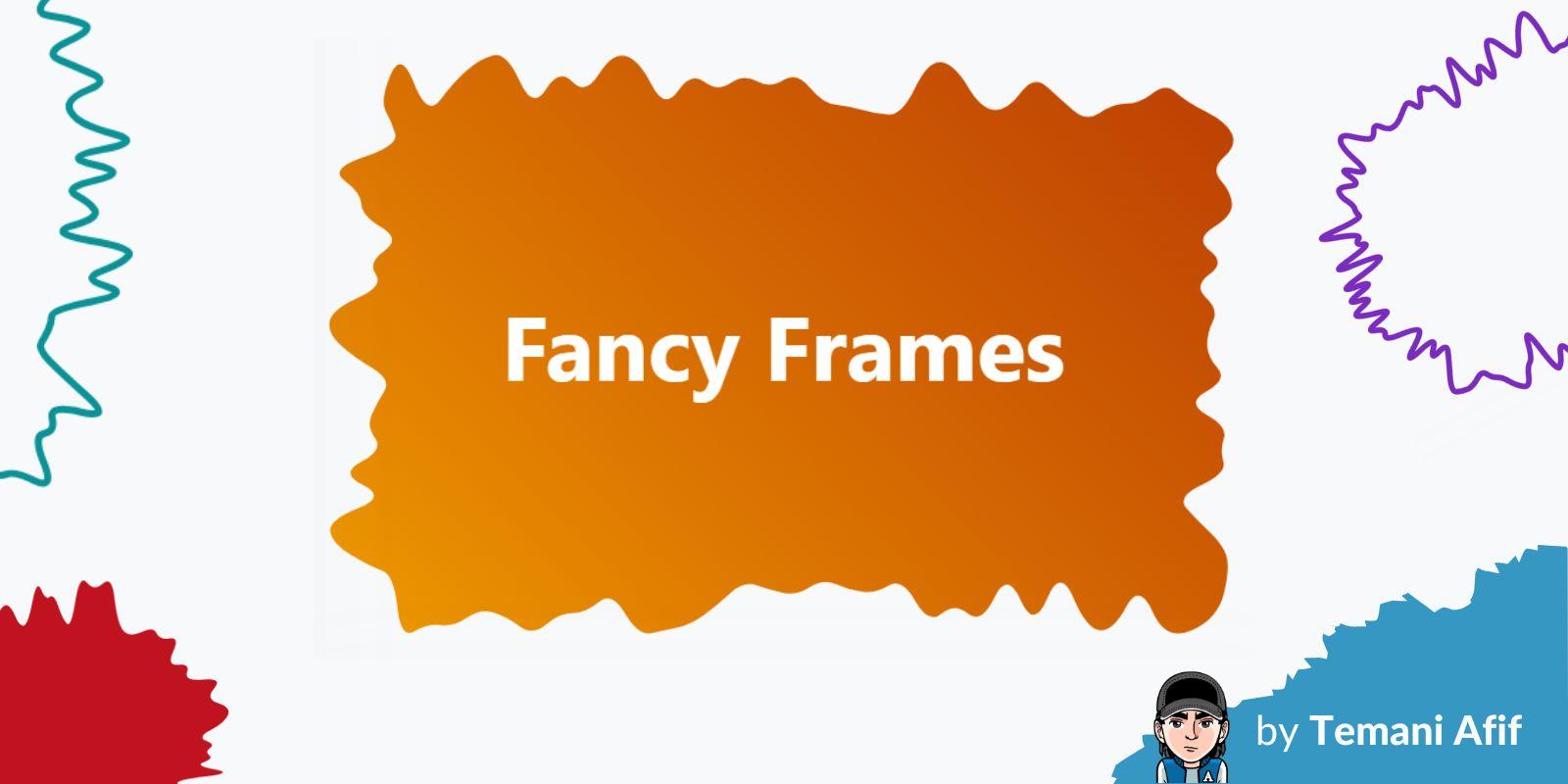
Temani Afif's CSS Generators site adds a fancy-frame generator that produces organic, irregular border shapes — squiggly, ragged, wavy, torn, and similar styles — entirely via clip-path: shape(). The generated code uses the shape() function's smooth curve commands combined with calc() expressions that mix percentage offsets and fixed pixel values to produce edges that scale with the element's dimensions while maintaining their organic character. The output is a single CSS rule applied to a .frame class, requiring no SVG, no background tricks, and no pseudo-elements. This tool extends Afif's existing generator collection and makes a previously code-heavy technique accessible through a point-and-click interface.
Tailwind CSS v4 vs MUI, Ant Design & Styled Components
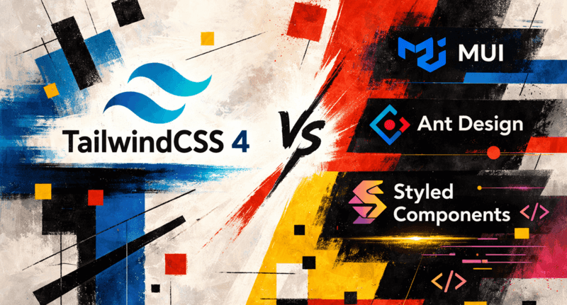
This architectural comparison frames Tailwind CSS v4, MUI, Ant Design, and Styled Components not as interchangeable styling options but as tools that operate at different layers of the stack. Tailwind v4's headline changes include a single-import setup (@import "tailwindcss"), a CSS-first @theme directive for token definitions using oklch color values, and a ground-up build rewrite delivering reported speeds of up to 5x faster full builds and 100x faster incremental builds. MUI and Ant Design ship complete component ecosystems — accessibility defaults, keyboard navigation, focus management — at the cost of opinionated DOM structure and a design language that may conflict with custom systems. Styled Components' runtime style generation carries overhead visible in high-frequency render scenarios and can leave dead styles in bundles. The article concludes with a practical decision matrix: Tailwind for custom design systems and multi-framework portability, UI kits for rapid dashboard delivery, and CSS-in-JS only where styling is tightly coupled to component props.
Kitty Giraudel walks through building an animated folded-corner hover effect using three layeredclip-path: polygon() shapes: the image cropped to a 5-point polygon (--fold-start-x: 30%, --fold-start-y: 25%), a white triangle pseudo-element representing the back of the fold (::before), and a shadow triangle (::after) for depth. Animating all layers is a matter of transitioning clip-path values over 400ms, with transitions inherited by pseudo-elements. The soft shadow workaround requires stacking roughly ten decorativedivs each offset by half a pixel using a --index custom property, because filter: blur() and clip-path are incompatible. The article notes that the sibling-index() function could eliminate the manual index counters but remains unsupported in Firefox at time of writing.
Kevin Powell demonstrates how to build an anchor-positioned nav highlight that shows a reflective glow effect, inspired by a Dribbble design featuring gradient glows on top and bottom bars. The core technique uses a transparent border with border-block-start and border-block-end to constrain the effect to horizontal edges, then replaces the border color with a radial gradient via the background shorthand set to padding-box and border-box clipping layers — the same approach used for CSS gradient borders without border-image. Anchor positioning ties the glow pseudo-element's width to the hovered link, extended 40px wider on each side with calc() to simulate light spread. Transition delays are split: on hover, inset updates instantly while opacity fades in; on mouse-out, opacity drops first (eliminating the stretching artifact) while inset resets after a 700ms delay. A subtle oklchbox-shadow on the links adds a matching reflected light effect on the surrounding elements.
Putting my money where my mouth is: a redesign built on progressive enhancement | utilitybend
Brecht De Ruyte rebuilt his personal site as a living proof-of-concept for progressive enhancement, layering corner-shape squircles, cross-document view transitions with :active-view-transition-type() direction awareness, @property-driven hue-shifting scroll orbs, and a no-JS anchor-positioning nav pill — all behind @supports checks and without a single polyfill. The type scale uses clamp()-based fluid sizing with custom tokens such as --s-font-size-base and --s-font-size-h1, while the color palette moves from SCSS variables to oklch and color-mix() in plain CSS with cascade layers (@layer vendor, tokens, reset, base, atoms, molecules, organisms, pages, utilities). Scroll-state queries power the sticky header shadow and hide/reveal behavior without Intersection Observer, and animation-timeline: scroll(root) drives a reading progress bar visible only on pages containing .article-body. The enhanced attr() syntax resolves view-transition-name values directly from data-vt HTML attributes, a pattern that is part of Interop 2026. CSS-only carousels using ::scroll-button() and scroll-state(scrollable) replace JavaScript-driven photo and Bluesky-feed strips.
Kevin Powell demonstrates how to build an anchor-positioned nav highlight that shows a reflective glow effect, inspired by a Dribbble design featuring gradient glows on top and bottom bars. The core technique uses a transparent border with border-block-start and border-block-end to constrain the effect to horizontal edges, then replaces the border color with a radial gradient via the background shorthand set to padding-box and border-box clipping layers — the same approach used for CSS gradient borders without border-image. Anchor positioning ties the glow pseudo-element's width to the hovered link, extended 40px wider on each side with calc() to simulate light spread. Transition delays are split: on hover, inset updates instantly while opacity fades in; on mouse-out, opacity drops first (eliminating the stretching artifact) while inset resets after a 700ms delay. A subtle oklchbox-shadow on the links adds a matching reflected light effect on the surrounding elements.
This concise reference covers every filter function accepted by backdrop-filter — blur(), brightness(), contrast(), grayscale(), hue-rotate(), invert(), saturate(), sepia(), opacity(), and drop-shadow() — and explains the critical ordering rule: filters are applied sequentially left to right, so brightness then contrast produces a different result than contrast then brightness. The guide also documents current browser-support gaps: opacity() is reliable only in Firefox Nightly and is silently ignored by Chrome, Edge, and Safari, while drop-shadow() shares the same limited availability. For production glassmorphism effects, the safe cross-browser stack is blur() paired with brightness(), contrast(), or grayscale(). A semi-transparent background is a practical requirement for the effect to be visible, though the author frames this as a useful design constraint rather than a limitation.
CSS Generator for Fancy Frames (Squiggly, Ragged, Wavy, Torn, etc.)
Temani Afif's CSS Generators site adds a fancy-frame generator that produces organic, irregular border shapes — squiggly, ragged, wavy, torn, and similar styles — entirely via clip-path: shape(). The generated code uses the shape() function's smooth curve commands combined with calc() expressions that mix percentage offsets and fixed pixel values to produce edges that scale with the element's dimensions while maintaining their organic character. The output is a single CSS rule applied to a .frame class, requiring no SVG, no background tricks, and no pseudo-elements. This tool extends Afif's existing generator collection and makes a previously code-heavy technique accessible through a point-and-click interface.
Tailwind CSS v4 vs MUI, Ant Design & Styled Components
This architectural comparison frames Tailwind CSS v4, MUI, Ant Design, and Styled Components not as interchangeable styling options but as tools that operate at different layers of the stack. Tailwind v4's headline changes include a single-import setup (@import "tailwindcss"), a CSS-first @theme directive for token definitions using oklch color values, and a ground-up build rewrite delivering reported speeds of up to 5x faster full builds and 100x faster incremental builds. MUI and Ant Design ship complete component ecosystems — accessibility defaults, keyboard navigation, focus management — at the cost of opinionated DOM structure and a design language that may conflict with custom systems. Styled Components' runtime style generation carries overhead visible in high-frequency render scenarios and can leave dead styles in bundles. The article concludes with a practical decision matrix: Tailwind for custom design systems and multi-framework portability, UI kits for rapid dashboard delivery, and CSS-in-JS only where styling is tightly coupled to component props.
Kitty Giraudel walks through building an animated folded-corner hover effect using three layeredclip-path: polygon() shapes: the image cropped to a 5-point polygon (--fold-start-x: 30%, --fold-start-y: 25%), a white triangle pseudo-element representing the back of the fold (::before), and a shadow triangle (::after) for depth. Animating all layers is a matter of transitioning clip-path values over 400ms, with transitions inherited by pseudo-elements. The soft shadow workaround requires stacking roughly ten decorativedivs each offset by half a pixel using a --index custom property, because filter: blur() and clip-path are incompatible. The article notes that the sibling-index() function could eliminate the manual index counters but remains unsupported in Firefox at time of writing.
Brecht De Ruyte's site redesign is this week's featured story and a masterclass in progressive enhancement: squircles via corner-shape, cross-document view transitions with directional awareness, scroll-state query-powered sticky headers, and CSS-only carousels using ::scroll-button() — all guarded by @supports, zero polyfills. The build demonstrates that Interop 2026 features are already usable today with proper fallback layering, including the enhanced attr() syntax that resolves view-transition-name directly from HTML data attributes.
Two CSS technique pieces deepen the creative toolkit. Kitty Giraudel's animated folded-corner effect layers threeclip-path: polygon() shapes with a clever shadow workaround for the filter: blur() incompatibility, while Temani Afif's fancy-frame generator produces organic clip-path: shape() borders entirely from a point-and-click UI. A backdrop-filter guide clarifies the sequential application order of filter functions and highlights the cross-browser gaps around opacity() and drop-shadow().
On the architectural side, a comparison of Tailwind CSS v4 against MUI, Ant Design, and Styled Components frames each as operating at a different layer of the stack rather than as interchangeable choices. Kevin Powell's anchor-positioning nav glow tutorial rounds out the week with a polished split-delay transition technique built around oklch gradients and border-box clipping.
Key Takeaways
Interop 2026 features like scroll-state queries, enhanced attr(), and ::scroll-button() are production-viable today behind @supports guards — De Ruyte's redesign is a copy-ready reference.
backdrop-filter filter functions apply left-to-right sequentially; opacity() and drop-shadow() remain unreliable outside Firefox Nightly, so stick to blur(), brightness(), contrast(), and grayscale() for cross-browser glassmorphism.
Tailwind v4 is the right tool for custom design systems and multi-framework portability; component libraries like MUI suit rapid dashboard delivery where their opinionated DOM is acceptable.