Week 12's design systems coverage addressed a wide spectrum from accessibility strategy to component architecture to UX decision-making. Deque's piece on… Compiled for immediate developer deployment.
calendar_todaysummarizeWeek 12-2026
article
TAG: ACCESSIBILITYREAD_TIME: 7_MIN
How Accessibility Programs Benefit from Both Manual and Automated Testing
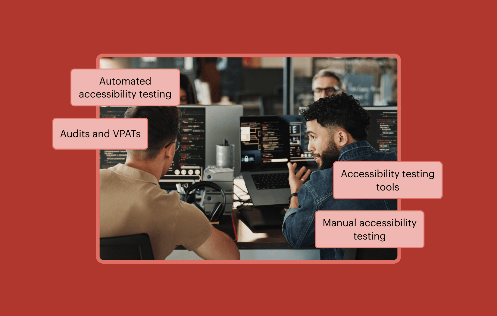
Automated accessibility tools such as Axe DevTools for Web, Axe DevTools Extension, and Axe Monitor can catch a significant share of violations early in the SDLC by running checks locally, in pull requests, and in CI/CD pipelines. However, automation is bounded by what can be programmatically determined: it cannot evaluate whether instructions are clear, whether interaction order supports task completion, or whether assistive technology announcements make contextual sense. Manual testing by trained evaluators covers these experiential gaps through structured reviews of page structure, interaction patterns, and user flows against standards like WCAG 2.2 AA or EN 301 549. Accessibility audits and VPATs — used for procurement and conformance reporting — depend on evidence from both automated and manual testing because automated results alone cannot satisfy all success criteria. Mature programs treat automation as an ongoing baseline and manual evaluation as the complement that verifies human-judgment-dependent requirements, with periodic audits serving as independent conformance snapshots.
Vitaly Friedman distinguishes between dialogs, overlays, modals, nonmodals, and lightboxes — terms that are often used interchangeably but carry meaningfully different interaction semantics. Modals are best suited for single, self-contained tasks where preserving the current page context (scrolling position, filter state, edited input) is critical, such as destructive action confirmations or quick confirmations. For complex, multi-step workflows that require users' full attention or frequent cross-reference with background data, standalone pages are the appropriate choice, while drawers fit sub-tasks that are too complex for a modal but do not warrant full-page navigation. Wizards and tabbed navigation within modals are discouraged even in enterprise products, where side panels and drawers typically serve better. For repeated tasks, both modals and page navigations add friction; expandable sections and in-place editing are preferable. Ryan Neufeld's four-step decision tree — evaluating context, task complexity, reference needs, and overlay type — provides a structured framework for making this call.
Chen Hui Jing walks through the UX challenge of communicating blockchain forwarding fees — where Circle's CCTP forwarding service deducts its fee from the recipient's received amount — and how to let the sender decide who bears the cost. The core decision was to never mutate user input automatically; instead, the fee is displayed separately using the HTML output element, and a checkbox lets the user opt to add the fee on top of the entered amount. Labeling the checkbox proved surprisingly tricky: options like 'you pay' versus 'receiver pays' felt awkward, and the final choice of 'Add on top' paired with a 'Recipient receives X USDC' display under the amount input communicated intent more naturally. A second, madlibs-style interface explored a sentence-based form pattern for the same logic, referencing Sara Soueidan's technique for custom checkbox and radio styling and the field-sizing CSS property (not yet supported in Firefox). The fieldset and legend elements provide semantic grouping for the fee controls, and background-attachment: fixed is recommended when using full-height gradient backgrounds.
Kitty Giraudel replaces the heading-anchors web component by Zach Leat with a build-time Eleventy Transform, eliminating a runtime JavaScript dependency entirely. The transform uses cheerio to parse HTML output, targets headings with .Post :where(h2, h3, h4)[id]:not([data-ha-exclude]), and injects both a visually hidden accessible anchor link and an aria-hidden placeholder span styled with CSS Anchor Positioning (anchor-name and position-anchor properties). Styling requires only three CSS rules matchingh2, h3, and h4 sizes, with an @supports fallback using absolute positioning for browsers that lack CSS Anchor Positioning support — now Baseline 2026. The key tradeoff compared to the web component is that cheerio operates headlessly, so it cannot read computed offsets for an exact JavaScript-style fallback, though the CSS fallback is adequate for this personal site. The result is a blog post that weighs roughly 25 KB total with all CSS and JavaScript inlined.
Neciu Dan argues that replacing anonymous arrow functions in useEffect with named function expressions — e.g., useEffect(function connectToInventoryWebSocket() {...}, [warehouseId]) — provides immediate readability and debugging benefits at zero tooling cost. Named effects appear with their identifiers in stack traces and React DevTools profiler output instead of 'anonymous', making error triage in tools like Sentry faster. Beyond readability, the naming exercise serves as a design smell detector: if you struggle to name an effect without using 'and' or 'also', it is likely doing two unrelated things and should be split. Similarly, vague names like syncDerivedValue signal logic that belongs in derived state or event handlers rather than effects. The technique extends to cleanup functions and applies equally to useCallback and useMemo. The author's practical formula: if an effect manages its own state and may be reused, extract it to a custom hook; if it is single-use with no associated state, name the function inline. React 19's Actions, use(), and Server Components further reduce the set of effects that genuinely need to exist.
OpenStatus rebuilt its data-table-filters project around a single-source-of-truth table schema that derives column definitions, filter fields, filter schema, and sheet fields from one createTableSchema declaration — collapsing what previously required five separate files into one. A BYOS (Bring Your Own Store) architecture introduces three pluggable state adapters (Memory, nuqs, zustand) all implementing a common StoreAdapter interface, making the state layer swappable with a single line change. Distribution is handled via the shadcn registry with nine installable blocks (npx shadcn@latest add) migrated to Tailwind v4, eliminating the need for a published npm package. A companion agent skill installable via npx skills add enables AI coding tools to understand the project structure, install the correct blocks, generate a schema from the data model, and wire up the state adapter through natural-language conversation. A Drizzle ORM integration with Supabase PostgreSQL and 39 test files including a SQL injection suite round out the production-ready setup.
The Syntax channel's March CSS tournament reaches the quarterfinals, where eight developers compete head-to-head in timed CSS pixel-matching challenges using only HTML and CSS — no JavaScript. Each four-battle round gives competitors two minutes to plan and fifteen minutes to build a bento-style testimonial grid layout featuring CSS Grid, box shadows, inset shadows, avatar clipping with border-radius, and a gradient text fade. Key techniques observed across competitors include CSS Grid template areas, grid-column and grid-row span placement, nth-child selectors for background color assignment, flexbox for inner card layout, and font-size tuning for pixel-accurate text matching. Scott defeated Chris (92% vs 81%), Kyle eliminated Julia (96% vs 89%), Wes beat Adam (99.68% vs 87%), and Josh narrowly defeated Kevin (97% vs an incomplete score), advancing Kyle, Scott, Wes, and Josh to the semi-finals.
How Accessibility Programs Benefit from Both Manual and Automated Testing
Automated accessibility tools such as Axe DevTools for Web, Axe DevTools Extension, and Axe Monitor can catch a significant share of violations early in the SDLC by running checks locally, in pull requests, and in CI/CD pipelines. However, automation is bounded by what can be programmatically determined: it cannot evaluate whether instructions are clear, whether interaction order supports task completion, or whether assistive technology announcements make contextual sense. Manual testing by trained evaluators covers these experiential gaps through structured reviews of page structure, interaction patterns, and user flows against standards like WCAG 2.2 AA or EN 301 549. Accessibility audits and VPATs — used for procurement and conformance reporting — depend on evidence from both automated and manual testing because automated results alone cannot satisfy all success criteria. Mature programs treat automation as an ongoing baseline and manual evaluation as the complement that verifies human-judgment-dependent requirements, with periodic audits serving as independent conformance snapshots.
The Syntax channel's March CSS tournament reaches the quarterfinals, where eight developers compete head-to-head in timed CSS pixel-matching challenges using only HTML and CSS — no JavaScript. Each four-battle round gives competitors two minutes to plan and fifteen minutes to build a bento-style testimonial grid layout featuring CSS Grid, box shadows, inset shadows, avatar clipping with border-radius, and a gradient text fade. Key techniques observed across competitors include CSS Grid template areas, grid-column and grid-row span placement, nth-child selectors for background color assignment, flexbox for inner card layout, and font-size tuning for pixel-accurate text matching. Scott defeated Chris (92% vs 81%), Kyle eliminated Julia (96% vs 89%), Wes beat Adam (99.68% vs 87%), and Josh narrowly defeated Kevin (97% vs an incomplete score), advancing Kyle, Scott, Wes, and Josh to the semi-finals.
Vitaly Friedman distinguishes between dialogs, overlays, modals, nonmodals, and lightboxes — terms that are often used interchangeably but carry meaningfully different interaction semantics. Modals are best suited for single, self-contained tasks where preserving the current page context (scrolling position, filter state, edited input) is critical, such as destructive action confirmations or quick confirmations. For complex, multi-step workflows that require users' full attention or frequent cross-reference with background data, standalone pages are the appropriate choice, while drawers fit sub-tasks that are too complex for a modal but do not warrant full-page navigation. Wizards and tabbed navigation within modals are discouraged even in enterprise products, where side panels and drawers typically serve better. For repeated tasks, both modals and page navigations add friction; expandable sections and in-place editing are preferable. Ryan Neufeld's four-step decision tree — evaluating context, task complexity, reference needs, and overlay type — provides a structured framework for making this call.
Chen Hui Jing walks through the UX challenge of communicating blockchain forwarding fees — where Circle's CCTP forwarding service deducts its fee from the recipient's received amount — and how to let the sender decide who bears the cost. The core decision was to never mutate user input automatically; instead, the fee is displayed separately using the HTML output element, and a checkbox lets the user opt to add the fee on top of the entered amount. Labeling the checkbox proved surprisingly tricky: options like 'you pay' versus 'receiver pays' felt awkward, and the final choice of 'Add on top' paired with a 'Recipient receives X USDC' display under the amount input communicated intent more naturally. A second, madlibs-style interface explored a sentence-based form pattern for the same logic, referencing Sara Soueidan's technique for custom checkbox and radio styling and the field-sizing CSS property (not yet supported in Firefox). The fieldset and legend elements provide semantic grouping for the fee controls, and background-attachment: fixed is recommended when using full-height gradient backgrounds.
Kitty Giraudel replaces the heading-anchors web component by Zach Leat with a build-time Eleventy Transform, eliminating a runtime JavaScript dependency entirely. The transform uses cheerio to parse HTML output, targets headings with .Post :where(h2, h3, h4)[id]:not([data-ha-exclude]), and injects both a visually hidden accessible anchor link and an aria-hidden placeholder span styled with CSS Anchor Positioning (anchor-name and position-anchor properties). Styling requires only three CSS rules matchingh2, h3, and h4 sizes, with an @supports fallback using absolute positioning for browsers that lack CSS Anchor Positioning support — now Baseline 2026. The key tradeoff compared to the web component is that cheerio operates headlessly, so it cannot read computed offsets for an exact JavaScript-style fallback, though the CSS fallback is adequate for this personal site. The result is a blog post that weighs roughly 25 KB total with all CSS and JavaScript inlined.
Neciu Dan argues that replacing anonymous arrow functions in useEffect with named function expressions — e.g., useEffect(function connectToInventoryWebSocket() {...}, [warehouseId]) — provides immediate readability and debugging benefits at zero tooling cost. Named effects appear with their identifiers in stack traces and React DevTools profiler output instead of 'anonymous', making error triage in tools like Sentry faster. Beyond readability, the naming exercise serves as a design smell detector: if you struggle to name an effect without using 'and' or 'also', it is likely doing two unrelated things and should be split. Similarly, vague names like syncDerivedValue signal logic that belongs in derived state or event handlers rather than effects. The technique extends to cleanup functions and applies equally to useCallback and useMemo. The author's practical formula: if an effect manages its own state and may be reused, extract it to a custom hook; if it is single-use with no associated state, name the function inline. React 19's Actions, use(), and Server Components further reduce the set of effects that genuinely need to exist.
OpenStatus rebuilt its data-table-filters project around a single-source-of-truth table schema that derives column definitions, filter fields, filter schema, and sheet fields from one createTableSchema declaration — collapsing what previously required five separate files into one. A BYOS (Bring Your Own Store) architecture introduces three pluggable state adapters (Memory, nuqs, zustand) all implementing a common StoreAdapter interface, making the state layer swappable with a single line change. Distribution is handled via the shadcn registry with nine installable blocks (npx shadcn@latest add) migrated to Tailwind v4, eliminating the need for a published npm package. A companion agent skill installable via npx skills add enables AI coding tools to understand the project structure, install the correct blocks, generate a schema from the data model, and wire up the state adapter through natural-language conversation. A Drizzle ORM integration with Supabase PostgreSQL and 39 test files including a SQL injection suite round out the production-ready setup.
Week 12's design systems coverage addressed a wide spectrum from accessibility strategy to component architecture to UX decision-making. Deque's piece on accessibility testing clarified that tools like Axe DevTools for Web, the Axe DevTools Extension, and Axe Monitor can be run locally, in pull requests, and CI/CD pipelines to catch programmatically detectable issues early — but cannot evaluate experiential factors like instruction clarity, interaction order, or whether assistive technology announcements make contextual sense. Manual testing by trained evaluators against WCAG 2.2 AA or EN 301 549, combined with periodic audits for VPAT evidence, remains irreplaceable. Vitaly Friedman's UX decision tree for modals vs. separate pages distilled the tradeoffs: modals work for single self-contained tasks that preserve page context, while complex multi-step workflows belong on standalone pages, and drawers sit in between. Wizards inside modals are explicitly discouraged even in enterprise products.
OpenStatus rebuilt its data-table-filters project around a single createTableSchema declaration that derives column definitions, filter fields, and sheet fields from one source — collapsing five files into one. Its BYOS (Bring Your Own Store) architecture offers three swappable state adapters (Memory, nuqs, zustand) via a common StoreAdapter interface, distributed as shadcn registry blocks (npx shadcn@latest add). A companion agent skill installable via npx skills add lets AI coding tools generate schemas and wire adapters through natural-language conversation. Chen Hui Jing's form design case study on Circle's CCTP fee interface showed why never mutating user input automatically matters — and how the HTML output element, fieldset/legend semantics, and a madlibs-style interface each serve distinct communication goals.
Key Takeaways
Axe DevTools automation catches programmatically detectable accessibility issues early in the SDLC, but cannot replace manual evaluation of experiential factors required for WCAG 2.2 AA conformance and VPAT evidence.
OpenStatus's createTableSchema pattern collapses column definitions, filter fields, and sheet fields into a single declaration, and its BYOS StoreAdapter interface makes the state layer swappable with one line — distributed as shadcn registry blocks.
Modals are right for single self-contained tasks that preserve page context; complex multi-step workflows and frequent cross-referencing belong on standalone pages — wizards inside modals are explicitly discouraged even in enterprise products.