CSS gained meaningful new layout capabilities this week. The native gap decoration proposal — featuring an expanded column-rule and a new row-rule property — lets… Compiled for immediate developer deployment.
calendar_todaysummarizeWeek 21-2026
article
TAG: LAYOUTREAD_TIME: 7_MIN
CSS Gap Decorations: Styling Grid and Flex Gaps with column-rule and row-rule
CSS is finally getting native gap decoration support for grid and flex containers via expanded column-rule and a new row-rule property. The column-rule property, previously limited to multi-column layouts, now draws lines directly inside grid and flex column gaps — no extra markup or pseudo-element hacks required. A companion row-rule covers horizontal gaps, and a rule shorthand sets both axes at once. Fine-grained control comes through rule-break (controlling intersection behavior), rule-inset / rule-inset-cap / rule-inset-junction (trimming segment length), rule-visibility-items (showing rules only between actual items), and rule-overlap (controlling column-over-row layering). The repeat() function enables alternating styles and colors across gaps. Rule width, color, and insets are all animatable, making scroll-driven and hover transitions possible without JavaScript. Progressive enhancement via @supports is straightforward since unsupported browsers simply show empty gaps. Currently landing in Chromium and available in Safari TP.
RTL Support in 2 Fixes: dir="auto" and CSS Logical Properties
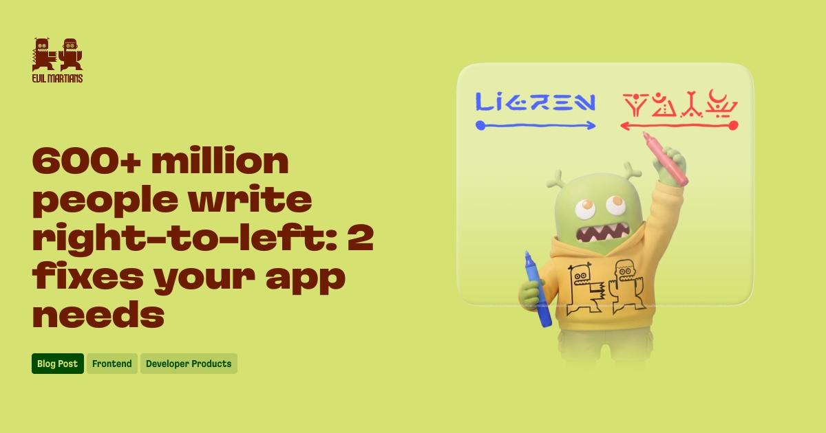
Over 600 million people write Arabic, Hebrew, Persian, and other right-to-left languages, yet most apps treat RTL as an afterthought. Evil Martians outlines two targeted fixes drawn from their bolt.new work. For English-only apps where users type in RTL languages, adding dir="auto" to free-form inputs (chat fields, prompt areas, comment boxes) lets the browser detect text direction in real time from the first strongly-directional character — no JavaScript, no navigator.language detection needed. For fully localized apps, set dir="rtl" on the html element and migrate the entire stylesheet from physical properties (margin-left, padding-right, text-align: left) to CSS Logical Properties (margin-inline-start, padding-inline-start, text-align: start). Logical properties express directional intent and let the browser handle LTR/RTL mapping automatically. The article also covers the icon-flip trap (only directional icons should flip via transform: scaleX(-1)), the flexbox auto-reversal behavior under dir="rtl", and using Stylelint's property-layout-mappings rule to prevent physical properties from creeping back in.
Mathematical Layouts with sibling-index() and sibling-count()
CSS Values and Units Level 5 introduces sibling-index() and sibling-count() — two integer-returning functions that give stylesheets direct access to an element's position among its siblings without JavaScript or hardcoded :nth-child() rules. sibling-index() returns a 1-based position; sibling-count() returns the total sibling element count. Both resolve to integers usable inside calc(), min(), max(), sin(), cos(), and other math functions, enabling staggered animation delays, automatic equal-width tabs, evenly spaced hue distributions, pure-CSS radial menus, and z-index stacking in a single declaration. The article covers key gotchas: display:none elements still occupy a DOM slot and affect counts, custom properties evaluated on a parent capture the parent's index rather than each child's, and shadow DOM scoping returns 0 when external CSS probes component internals. Chrome/Edge 138 and Safari 26.2 ship these in stable; Firefox implementation is underway. Progressive enhancement via @supports(z-index: sibling-index()) provides a safe static fallback.
Halftone in the Browser: Canvas-Based Screen Frequency and Dot Effects
Carmen Ansio recreates a real print halftone pipeline in the browser using the Canvas 2D API, grounded in prepress concepts like screen frequency, dot shape, and moire patterns. Luminance from each image pixel is sampled and mapped directly to dot radius (bright pixels yield larger white dots), with the core formula keeping the grid, frequency, and drawing primitive fully decoupled. Screen shapes — circle, hexagon, diamond, triangle — are swappable by changing only the draw call without altering the grid geometry. A hover effect turns the canvas cursor into an enlarger: dot size grows with proximity using Gaussian falloff (Math.exp(-dist squared / haloR squared)) rather than linear falloff to avoid a hard visible boundary, and angle from the cursor maps to hue for a full color-wheel bloom. A wave demo uses the same distance formula as a phase offset in a sine function so cubes farther from the origin peak later, producing a true propagating ripple sorted with the painter's algorithm. The canvas sits above the card with pointer-events: none so mouse events reach the underlying element.
What's Missing in CSS Layout: Pain Points from the 2025 State of CSS Survey
Patrick Brosset synthesizes the 2025 State of CSS survey's layout pain points alongside his own mini-survey on Mastodon, Bluesky, and LinkedIn to identify what developers actually need from CSS layout. Grid receives the most criticism for verbose syntax, confusing justify-* vs align-* naming, and the inability to animate track sizes or detect last-row orphans. Flexbox frustrations center on unpredictable flex-grow / flex-shrink / flex-basis interactions and the lack of per-wrapped-line control. The community's top missing feature — cited by ~12 respondents — is overflow and wrap detection in pure CSS, enabling responsive collapses and '+3' badges without JavaScript. Other frequently requested capabilities include CSS Regions for flowing text across boxes (like InDesign linked frames), CSS Exclusions for non-rectangular text wrapping, DOM-independent repositioning for responsive reordering, and content-aware grid spanning. The author concludes that overflow/wrap detection would unlock the most responsive design possibilities with the least added complexity.
The oklch() functional notation represents color in the Oklab perceptual color space, modeling lightness (L), chroma (C), and hue (H) in a way that mirrors human visual perception rather than screen light mixing. Compared to RGB, adjusting brightness in oklch() requires changing only the L value instead of simultaneously tuning R, G, and B — making color manipulation more predictable and gradients more accessible. The notation has had broad browser support since 2023 and opens access to the wider Display-P3 gamut for screens that support it, while remaining backwards-compatible on sRGB displays where colors appear nearly identical. One trade-off is gradient transitions: because hue is a polar dimension rather than a linear one, oklch() gradients can show unexpected hue shifts compared to sRGB or oklab-based gradients. The author recommends oklch() for prototyping components, building accessible color themes, and generating diverse palettes, while noting it is unlikely to fully replace RGB as the universal web standard until high-gamut hardware becomes mainstream.
5 Underrated CSS Properties Every Developer Should Know
Kevin Powell walks through five underused CSS properties with live demos. CSS counters (counter-reset, counter-increment, and counter() in content) let you auto-number non-list elements without touching the DOM, with an accessibility tip: add an empty alt-text slash after the counter() call to suppress screen-reader announcements. user-select: none prevents accidental text selection on buttons and drag targets. font-variant-numeric: tabular-nums forces proportional fonts to render numbers at uniform widths — useful for aligned data tables — without affecting non-numeric characters. The multi-column layout shorthand (column-count + column-width, e.g. 3 15ch) creates responsive column counts that adapt as the container resizes, with break-inside: avoid keeping cards intact across column breaks. Finally, text-decoration-thickness, text-underline-offset, text-decoration-style, and text-decoration-color give fine-grained control over link underlines, including animatable color transitions. Powell also notes that column-rule (which draws decorative lines between columns) is a precursor to the gap-decoration feature coming to grid and flexbox.
CSS Gap Decorations: Styling Grid and Flex Gaps with column-rule and row-rule
CSS is finally getting native gap decoration support for grid and flex containers via expanded column-rule and a new row-rule property. The column-rule property, previously limited to multi-column layouts, now draws lines directly inside grid and flex column gaps — no extra markup or pseudo-element hacks required. A companion row-rule covers horizontal gaps, and a rule shorthand sets both axes at once. Fine-grained control comes through rule-break (controlling intersection behavior), rule-inset / rule-inset-cap / rule-inset-junction (trimming segment length), rule-visibility-items (showing rules only between actual items), and rule-overlap (controlling column-over-row layering). The repeat() function enables alternating styles and colors across gaps. Rule width, color, and insets are all animatable, making scroll-driven and hover transitions possible without JavaScript. Progressive enhancement via @supports is straightforward since unsupported browsers simply show empty gaps. Currently landing in Chromium and available in Safari TP.
5 Underrated CSS Properties Every Developer Should Know
Kevin Powell walks through five underused CSS properties with live demos. CSS counters (counter-reset, counter-increment, and counter() in content) let you auto-number non-list elements without touching the DOM, with an accessibility tip: add an empty alt-text slash after the counter() call to suppress screen-reader announcements. user-select: none prevents accidental text selection on buttons and drag targets. font-variant-numeric: tabular-nums forces proportional fonts to render numbers at uniform widths — useful for aligned data tables — without affecting non-numeric characters. The multi-column layout shorthand (column-count + column-width, e.g. 3 15ch) creates responsive column counts that adapt as the container resizes, with break-inside: avoid keeping cards intact across column breaks. Finally, text-decoration-thickness, text-underline-offset, text-decoration-style, and text-decoration-color give fine-grained control over link underlines, including animatable color transitions. Powell also notes that column-rule (which draws decorative lines between columns) is a precursor to the gap-decoration feature coming to grid and flexbox.
RTL Support in 2 Fixes: dir="auto" and CSS Logical Properties
Over 600 million people write Arabic, Hebrew, Persian, and other right-to-left languages, yet most apps treat RTL as an afterthought. Evil Martians outlines two targeted fixes drawn from their bolt.new work. For English-only apps where users type in RTL languages, adding dir="auto" to free-form inputs (chat fields, prompt areas, comment boxes) lets the browser detect text direction in real time from the first strongly-directional character — no JavaScript, no navigator.language detection needed. For fully localized apps, set dir="rtl" on the html element and migrate the entire stylesheet from physical properties (margin-left, padding-right, text-align: left) to CSS Logical Properties (margin-inline-start, padding-inline-start, text-align: start). Logical properties express directional intent and let the browser handle LTR/RTL mapping automatically. The article also covers the icon-flip trap (only directional icons should flip via transform: scaleX(-1)), the flexbox auto-reversal behavior under dir="rtl", and using Stylelint's property-layout-mappings rule to prevent physical properties from creeping back in.
Mathematical Layouts with sibling-index() and sibling-count()
CSS Values and Units Level 5 introduces sibling-index() and sibling-count() — two integer-returning functions that give stylesheets direct access to an element's position among its siblings without JavaScript or hardcoded :nth-child() rules. sibling-index() returns a 1-based position; sibling-count() returns the total sibling element count. Both resolve to integers usable inside calc(), min(), max(), sin(), cos(), and other math functions, enabling staggered animation delays, automatic equal-width tabs, evenly spaced hue distributions, pure-CSS radial menus, and z-index stacking in a single declaration. The article covers key gotchas: display:none elements still occupy a DOM slot and affect counts, custom properties evaluated on a parent capture the parent's index rather than each child's, and shadow DOM scoping returns 0 when external CSS probes component internals. Chrome/Edge 138 and Safari 26.2 ship these in stable; Firefox implementation is underway. Progressive enhancement via @supports(z-index: sibling-index()) provides a safe static fallback.
Halftone in the Browser: Canvas-Based Screen Frequency and Dot Effects
Carmen Ansio recreates a real print halftone pipeline in the browser using the Canvas 2D API, grounded in prepress concepts like screen frequency, dot shape, and moire patterns. Luminance from each image pixel is sampled and mapped directly to dot radius (bright pixels yield larger white dots), with the core formula keeping the grid, frequency, and drawing primitive fully decoupled. Screen shapes — circle, hexagon, diamond, triangle — are swappable by changing only the draw call without altering the grid geometry. A hover effect turns the canvas cursor into an enlarger: dot size grows with proximity using Gaussian falloff (Math.exp(-dist squared / haloR squared)) rather than linear falloff to avoid a hard visible boundary, and angle from the cursor maps to hue for a full color-wheel bloom. A wave demo uses the same distance formula as a phase offset in a sine function so cubes farther from the origin peak later, producing a true propagating ripple sorted with the painter's algorithm. The canvas sits above the card with pointer-events: none so mouse events reach the underlying element.
What's Missing in CSS Layout: Pain Points from the 2025 State of CSS Survey
Patrick Brosset synthesizes the 2025 State of CSS survey's layout pain points alongside his own mini-survey on Mastodon, Bluesky, and LinkedIn to identify what developers actually need from CSS layout. Grid receives the most criticism for verbose syntax, confusing justify-* vs align-* naming, and the inability to animate track sizes or detect last-row orphans. Flexbox frustrations center on unpredictable flex-grow / flex-shrink / flex-basis interactions and the lack of per-wrapped-line control. The community's top missing feature — cited by ~12 respondents — is overflow and wrap detection in pure CSS, enabling responsive collapses and '+3' badges without JavaScript. Other frequently requested capabilities include CSS Regions for flowing text across boxes (like InDesign linked frames), CSS Exclusions for non-rectangular text wrapping, DOM-independent repositioning for responsive reordering, and content-aware grid spanning. The author concludes that overflow/wrap detection would unlock the most responsive design possibilities with the least added complexity.
The oklch() functional notation represents color in the Oklab perceptual color space, modeling lightness (L), chroma (C), and hue (H) in a way that mirrors human visual perception rather than screen light mixing. Compared to RGB, adjusting brightness in oklch() requires changing only the L value instead of simultaneously tuning R, G, and B — making color manipulation more predictable and gradients more accessible. The notation has had broad browser support since 2023 and opens access to the wider Display-P3 gamut for screens that support it, while remaining backwards-compatible on sRGB displays where colors appear nearly identical. One trade-off is gradient transitions: because hue is a polar dimension rather than a linear one, oklch() gradients can show unexpected hue shifts compared to sRGB or oklab-based gradients. The author recommends oklch() for prototyping components, building accessible color themes, and generating diverse palettes, while noting it is unlikely to fully replace RGB as the universal web standard until high-gamut hardware becomes mainstream.
CSS gained meaningful new layout capabilities this week. The native gap decoration proposal — featuring an expanded column-rule and a new row-rule property — lets developers draw styled lines inside grid and flex gaps without extra markup, with rule-break, rule-inset, rule-visibility-items, and rule-overlap providing fine-grained control; both width and color are animatable. Alongside this, CSS Values and Units Level 5's sibling-index() and sibling-count() functions landed in stable Chrome/Edge 138 and Safari 26.2, enabling staggered animations, radial menus, and z-index stacking from a single CSS declaration — with Firefox support in progress.
Internationalization got a concise guide from Evil Martians: adding dir="auto" to free-form inputs handles real-time RTL detection for the majority of cases, while migrating physical properties (margin-left, padding-right) to CSS Logical Properties (margin-inline-start, padding-inline-start) handles fully localized layouts — with Stylelint's property-layout-mappings rule enforcing the migration at lint time. On the color front, oklch() was highlighted as a perceptual color space available in all major browsers since 2023, offering predictable brightness adjustments and Display-P3 gamut access.
Developer experience also featured: Kevin Powell walked through five underused properties — CSS counters, user-select: none, font-variant-numeric: tabular-nums, multi-column shorthand, and fine-grained text-decoration control. Patrick Brosset synthesized the 2025 State of CSS survey, finding overflow/wrap detection the most requested missing feature, followed by CSS Regions and CSS Exclusions.
Key Takeaways
Native CSS gap decorations (column-rule + row-rule, with rule-break and rule-inset controls) are landing in Chromium and Safari TP — eliminates pseudo-element hacks for grid/flex dividers.
sibling-index() and sibling-count() are now stable in Chrome/Edge 138 and Safari 26.2, enabling pure-CSS staggered animations and dynamic layouts without JavaScript or :nth-child() workarounds.
For RTL support, dir="auto" on inputs plus CSS Logical Properties site-wide is the minimal, correct approach — Stylelint's property-layout-mappings rule can enforce the migration automatically.