Weekly Digest // STYLING — Week 30-2026
paletteWeekly Report

Motion UI: A Performance-Graded React… — Week 30 CSS & Styling

This week’s CSS & Styling issue lands during a moment of genuine browser convergence: discrete-value transitions, @starting-style, and writing-mode are now…

calendar_todaysummarizeWeek 30-2026
Reading mode
Page 1 of 5: Overview

Overview

summarizeDigest_Summary

This week’s CSS & Styling issue lands during a moment of genuine browser convergence: discrete-value transitions, @starting-style, and writing-mode are now baseline across all modern engines, while text-fit arrives in Chromium as a taste of what’s next. The net effect is that animation, internationalisation, and layout work that once demanded JavaScript workarounds can now be written in pure CSS.

The featured piece is Motion UI, Matt Perry’s production-ready React animation library shipping inside the Motion+ membership. Its MotionScore grading (S for compositor-only down to F for paint-triggering) gives teams an instant render-cost audit, while a single motion.theme.ts file centralises five physics-backed transition personalities that retune every installed component sitewide. Motion UI is the first animation library that treats performance and design-system integration as first-class citizens rather than afterthoughts.

At the CSS level, Kevin Powell shows that animating to and from display: none now takes exactly two additions — transition-behavior: allow-discrete plus an @starting-style block — while Mojtaba Seyedi’s CSS-Tricks almanac entry makes the case that writing-mode is not a typographic novelty but a fundamental axis-reorientation that reshapes Flexbox, Grid, and every logical property at once. Temani Afif rounds out the issue with text-fit, a Chromium-only emerging property that scales font size to fill a container — already powerful enough to make responsive ASCII art a three-line snippet.

Taken together, the week’s content points toward a CSS that is increasingly expressive without requiring JavaScript scaffolding: transitions handle their own lifecycle, layout axes adapt to writing direction, and text scales itself to its container.

Key Takeaways
  • Add transition-behavior: allow-discrete and an @starting-style block (placed after the open state in cascade order) to animate any element to and from display: none in all modern browsers without JavaScript.
  • Before shipping an animation, check its MotionScore category — compositor-only transforms and opacity earn an S, while paint-triggering properties drop to C or below and should be used sparingly.
  • Adopt logical CSS properties (inline-size, margin-inline-start, padding-block-end) so your layouts automatically adapt when writing-mode changes, making internationalisation and vertical typography zero-cost refactors.

data_usageMETRICS_OVERVIEW

  • TOTAL_ITEMS4
  • EST_READ_TIME8_MIN
  • CRITICAL_UPDATES00
Motion UI: A Performance-Graded React Animation Library
TAG: TOOLINGREAD_TIME: 3_MIN

Motion UI: A Performance-Graded React Animation Library

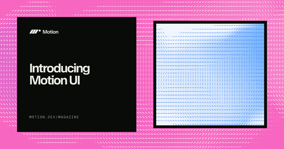
Matt Perry has launched Motion UI, a production-ready animated component library for React distributed through the Motion+ membership. Every component carries a MotionScore grade — S for compositor-only animations down to C for paint-triggering ones — so teams can audit render cost before shipping. The library integrates into existing design systems via shadcn’s semantic tokens (bg-background, text-muted-foreground, --primary) with zero configuration, or adapts to non-shadcn stacks via an AI prompt builder or Motion AI Kit MCP. A motion.theme.ts file centralises five named transition personalities (snap, ui, gentle, lively, ambient) built on physics-backed springs, so a single edit retunes every installed animation sitewide; reducedMotion: “calm” is built in, preserving opacity fades while removing transforms.
BY: Matt Perry

ANIMATIONREACTMOTIONDESIGN-SYSTEM
Animating display: none — Two Properties, Pure CSS
play_arrow
5:30
CSS FEATURE

Animating display: none — Two Properties, Pure CSS

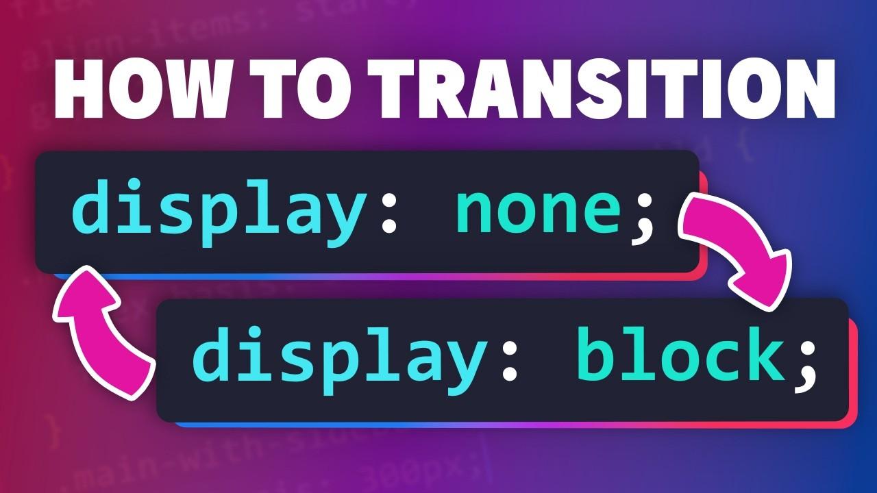
Kevin Powell demonstrates that animating to and from display: none now requires exactly two additions: transition-behavior: allow-discrete to permit transitions on discrete-value properties, and @starting-style to define an element’s state before its first paint. The key constraint is cascade order — @starting-style must appear after the open state rule, or the last-rule-wins cascade will override it and the transition will silently fail. Using a <dialog> with Invoker Commands, Powell builds distinct entry and exit animations (translate up on enter, down on exit) plus an animated ::backdrop opacity — all without JavaScript. The technique works for any element toggling between display: none and any display value and is fully supported in all modern browsers.

Responsive ASCII Art in Three Lines with text-fit
TAG: CSS FEATUREREAD_TIME: 2_MIN

Responsive ASCII Art in Three Lines with text-fit

Temani Afif demonstrates how the emerging text-fit CSS property — currently Chromium-only — scales font size to fill a container, enabling fully responsive ASCII art with just white-space: pre and text-fit: shrink consistent. The property exposes three scaling modes: consistent (uniform scale across all lines, preserving the ASCII grid structure), per-line (each line scales independently to fill its row), and per-line-all (same as per-line but also includes the last line). The consistent mode is the critical one for ASCII art — without uniform scaling, the grid alignment breaks. No JavaScript, no SVG, and no container-query gymnastics are needed; the property handles the math. Browser support remains limited to Chromium for now, so treat this as a progressive enhancement or internal-tooling use case.

BY: Temani Afif

CSSTYPOGRAPHYEXPERIMENTALTEXT-FIT
writing-mode Is an Axis Reorientation, Not Just Rotated Text
TAG: CSS FEATUREREAD_TIME: 3_MIN

writing-mode Is an Axis Reorientation, Not Just Rotated Text

Mojtaba Seyedi’s CSS-Tricks almanac entry makes the case that writing-mode — values horizontal-tb, vertical-rl, vertical-lr, sideways-rl, sideways-lr — does far more than rotate glyphs: it redefines the block and inline axes that all of modern CSS layout is built on. Under vertical-rl, flex-direction: row runs vertically, inline-size maps to the physical height dimension, and margin-inline-start resolves to the top edge. The property is inherited, not animatable, and enjoys full browser support under CSS Writing Modes Level 4. The practical takeaway is that layouts written with logical properties (inline-size, padding-block-end, margin-inline-start) adapt automatically to any writing mode, making internationalisation and creative vertical typography essentially free refactors.

BY: Mojtaba Seyedi

CSSTYPOGRAPHYLAYOUTI18N