This week in CSS was defined by two converging themes: powerful new layout and geometry primitives arriving in browsers, and a practical reckoning with how… Compiled for immediate developer deployment.
calendar_todaysummarizeWeek 8-2026
article
TAG: DEEP DIVEREAD_TIME: 6_MIN
una.im | border-shape: the future of the non-rectangular web
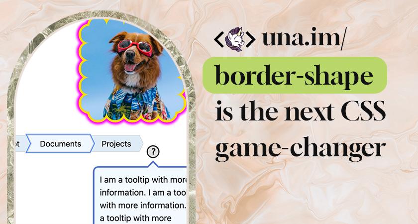
The upcoming border-shape CSS property, testable in Chrome Canary 146+ behind the experimental web platform features flag, redefines an element's actual border geometry rather than merely masking it like clip-path does. Defined in CSS Borders and Box Decorations Module Level 4, it accepts circle(), ellipse(), inset(), polygon(), the new shape() function, and SVG-style path strings. When a shape is applied, background, border-image, focus outline, and box-shadow all follow that new geometry automatically. The article walks through three practical demos: a tooltip driven by custom properties (--ap, --ah, --aw for arrow position, height, and width) using shape() with anchored container queries; a chevron navigation component built with a compact shape() path and no z-index tricks; and a scalloped border composed entirely from arc commands using the content-box keyword for percentage coordinates.
Navigation API - a better way to navigate, is now Baseline Newly Available | Blog | web.dev
The Navigation API reached Baseline Newly Available status in early 2026 after support landed in Safari and Firefox. It replaces the decade-old History API pattern — which required separate listeners for link clicks, popstate events, and programmatic history.pushState() calls (the popstate event notably does not fire on pushState or replaceState) — with a single navigation.addEventListener('navigate', ...) that intercepts every navigation type. The event.intercept() handler receives automatic URL updates and automatic focus management for accessibility. A NavigateEvent.formData property handles same-document form submissions without extra JavaScript. A scroll: 'manual' option gives fine-grained control over scroll restoration timing, preventing premature scrolling while async content loads. The article also shows how wrapping DOM updates in document.startViewTransition() inside the handler enables seamless app-like page transitions in SPAs.
Building Fluid Typographic Scales with clamp() and :heading()
This article extends a prior post on :heading() and pow() by adding fluid scaling via clamp(). The approach defines a linear ramp between minimum and maximum viewport widths (e.g., 375px to 1440px) with rem-based min and max sizes, letting the maths interpolate automatically. Because each heading level maps a --heading-level custom property (h1 = 5, h6 = 0), the clamp() logic lives in one :heading block rather than duplicated across six selectors. The article explains the exponent assignment: h1 uses exponent 5 so that 1rem multiplied by the scale ratio raised to that power produces the largest size, while h6 at exponent 0 evaluates to the base size. An important WCAG 1.4.4 note: clamp() min and max must use rem (never px) so the scale respects browser zoom. The :heading() pseudo-class and pow() are currently experimental, available only in Safari Technology Preview.
Typographic Scales in CSS with :heading(), sibling-index(), and pow()
This article demonstrates how combining :heading(), sibling-index(), and pow() (from CSS Values and Units Level 4) collapses a verbose typographic scale into three custom properties and one font-size rule. The core formula is font-size = base-size x ratio^(6 - sibling-index()): for h1 (index 1) that becomes ratio^5, the largest value; for h6 (index 6) it becomes ratio^0 = 1, the base size. With a Perfect Fourth ratio (1.333), h1 lands at 4.209rem and h6 at 1rem. Swapping ratios — Minor Third (1.2), Major Third (1.25), Perfect Fifth (1.5) — requires changing a single --typographic-scale variable. The article flags a critical limitation: sibling-index() counts DOM siblings, not semantic heading levels, so repeated or skipped heading tags break the scale. A fallback approach using explicit --heading-level assignments on each :heading(N) selector is provided for real-world layouts. Currently only Safari Technology Preview supports all three features.
Temani Afif lays out the precise browser rule that governs whether an anchor-name is resolvable: the anchor element's box must be fully laid out before the positioned element's box. This single rule explains a cascade of frustrating edge cases. When .element is a child of .anchor, adding any non-static position to .anchor makes it a containing block, breaking the rule — except when .element uses position: fixed, which shifts its containing block to the viewport. Sibling order matters too: if .anchor appears after .element in the DOM and carries position: absolute or fixed, the lookup fails; position: relative or sticky on the anchor still works because those are laid out before absolutely-positioned elements. z-index cannot fix ordering failures. The most complete failure mode is when .anchor sits entirely outside .element's containing block — the reference is always invalid regardless of DOM order.
CSS Anchor Positioning: Scoping, Implicit Anchors, and Conditional Hiding
This fourth and final post in a CSS Anchor Positioning series covers anchor-scope, implicit anchors, and position-visibility. The anchor-scope property solves the naming-collision problem that arises when repeated components share the same anchor-name: without it, all tooltips in a card list stack on the last DOM element because anchor names are globally visible. Applying anchor-scope: --card to each parent li creates a subtree boundary fixing this. Implicit anchors, created automatically by the Popover API via popovertarget or the showPopover({ source }) JavaScript call, bypass CSS naming entirely and are inherently collision-free. Finally, position-visibility with values anchors-visible and no-overflow controls graceful hiding: when triggered, the element's visibility computes to force-hidden, a hard override that descendant visibility: visible declarations cannot escape. Chrome's current implementation defaults to always rather than the spec-defined anchors-visible, a divergence still under CSSWG discussion.
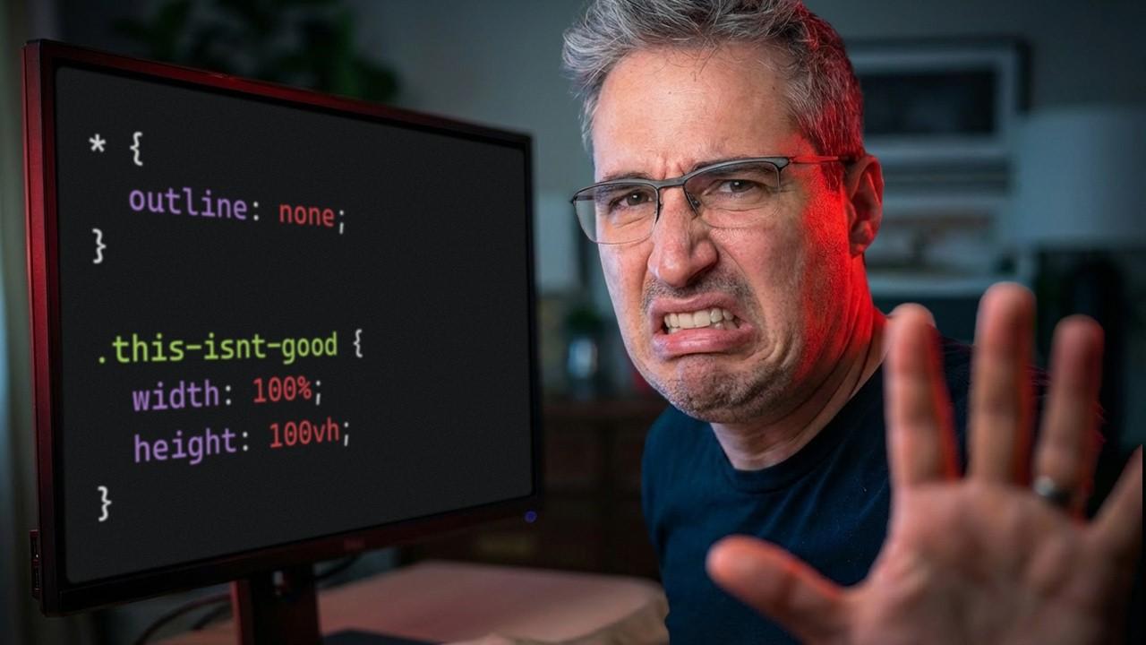
Kevin Powell walks through five recurring CSS mistakes he sees even from experienced developers. First: redundant width: 100% on block elements — adding an explicit 100% width causes overflow when margins are added, because box-sizing: border-box does not account for margins. Second: using a fixed height instead of min-height, which breaks as content grows. Third: copy-pasted component styles that diverge over time — Powell demos his own live site, where a duplicated fancy-button and link-button pair and a misclosed @layer block show the real cost of skipping cleanup. Fourth: suppressing focus rings with outline: none globally instead of using :focus-visible, which lets the browser apply rings only during keyboard navigation (not mouse clicks) — demonstrated with a keyboard walkthrough of ESPN where focused elements are completely invisible. Fifth: overusing one layout tool — reaching for flexbox where CSS Grid is the cleaner fit, a pattern Powell says is amplified by AI models trained on older flexbox-heavy code.
una.im | border-shape: the future of the non-rectangular web
The upcoming border-shape CSS property, testable in Chrome Canary 146+ behind the experimental web platform features flag, redefines an element's actual border geometry rather than merely masking it like clip-path does. Defined in CSS Borders and Box Decorations Module Level 4, it accepts circle(), ellipse(), inset(), polygon(), the new shape() function, and SVG-style path strings. When a shape is applied, background, border-image, focus outline, and box-shadow all follow that new geometry automatically. The article walks through three practical demos: a tooltip driven by custom properties (--ap, --ah, --aw for arrow position, height, and width) using shape() with anchored container queries; a chevron navigation component built with a compact shape() path and no z-index tricks; and a scalloped border composed entirely from arc commands using the content-box keyword for percentage coordinates.
Kevin Powell walks through five recurring CSS mistakes he sees even from experienced developers. First: redundant width: 100% on block elements — adding an explicit 100% width causes overflow when margins are added, because box-sizing: border-box does not account for margins. Second: using a fixed height instead of min-height, which breaks as content grows. Third: copy-pasted component styles that diverge over time — Powell demos his own live site, where a duplicated fancy-button and link-button pair and a misclosed @layer block show the real cost of skipping cleanup. Fourth: suppressing focus rings with outline: none globally instead of using :focus-visible, which lets the browser apply rings only during keyboard navigation (not mouse clicks) — demonstrated with a keyboard walkthrough of ESPN where focused elements are completely invisible. Fifth: overusing one layout tool — reaching for flexbox where CSS Grid is the cleaner fit, a pattern Powell says is amplified by AI models trained on older flexbox-heavy code.
Navigation API - a better way to navigate, is now Baseline Newly Available | Blog | web.dev
The Navigation API reached Baseline Newly Available status in early 2026 after support landed in Safari and Firefox. It replaces the decade-old History API pattern — which required separate listeners for link clicks, popstate events, and programmatic history.pushState() calls (the popstate event notably does not fire on pushState or replaceState) — with a single navigation.addEventListener('navigate', ...) that intercepts every navigation type. The event.intercept() handler receives automatic URL updates and automatic focus management for accessibility. A NavigateEvent.formData property handles same-document form submissions without extra JavaScript. A scroll: 'manual' option gives fine-grained control over scroll restoration timing, preventing premature scrolling while async content loads. The article also shows how wrapping DOM updates in document.startViewTransition() inside the handler enables seamless app-like page transitions in SPAs.
Building Fluid Typographic Scales with clamp() and :heading()
This article extends a prior post on :heading() and pow() by adding fluid scaling via clamp(). The approach defines a linear ramp between minimum and maximum viewport widths (e.g., 375px to 1440px) with rem-based min and max sizes, letting the maths interpolate automatically. Because each heading level maps a --heading-level custom property (h1 = 5, h6 = 0), the clamp() logic lives in one :heading block rather than duplicated across six selectors. The article explains the exponent assignment: h1 uses exponent 5 so that 1rem multiplied by the scale ratio raised to that power produces the largest size, while h6 at exponent 0 evaluates to the base size. An important WCAG 1.4.4 note: clamp() min and max must use rem (never px) so the scale respects browser zoom. The :heading() pseudo-class and pow() are currently experimental, available only in Safari Technology Preview.
Typographic Scales in CSS with :heading(), sibling-index(), and pow()
This article demonstrates how combining :heading(), sibling-index(), and pow() (from CSS Values and Units Level 4) collapses a verbose typographic scale into three custom properties and one font-size rule. The core formula is font-size = base-size x ratio^(6 - sibling-index()): for h1 (index 1) that becomes ratio^5, the largest value; for h6 (index 6) it becomes ratio^0 = 1, the base size. With a Perfect Fourth ratio (1.333), h1 lands at 4.209rem and h6 at 1rem. Swapping ratios — Minor Third (1.2), Major Third (1.25), Perfect Fifth (1.5) — requires changing a single --typographic-scale variable. The article flags a critical limitation: sibling-index() counts DOM siblings, not semantic heading levels, so repeated or skipped heading tags break the scale. A fallback approach using explicit --heading-level assignments on each :heading(N) selector is provided for real-world layouts. Currently only Safari Technology Preview supports all three features.
Temani Afif lays out the precise browser rule that governs whether an anchor-name is resolvable: the anchor element's box must be fully laid out before the positioned element's box. This single rule explains a cascade of frustrating edge cases. When .element is a child of .anchor, adding any non-static position to .anchor makes it a containing block, breaking the rule — except when .element uses position: fixed, which shifts its containing block to the viewport. Sibling order matters too: if .anchor appears after .element in the DOM and carries position: absolute or fixed, the lookup fails; position: relative or sticky on the anchor still works because those are laid out before absolutely-positioned elements. z-index cannot fix ordering failures. The most complete failure mode is when .anchor sits entirely outside .element's containing block — the reference is always invalid regardless of DOM order.
CSS Anchor Positioning: Scoping, Implicit Anchors, and Conditional Hiding
This fourth and final post in a CSS Anchor Positioning series covers anchor-scope, implicit anchors, and position-visibility. The anchor-scope property solves the naming-collision problem that arises when repeated components share the same anchor-name: without it, all tooltips in a card list stack on the last DOM element because anchor names are globally visible. Applying anchor-scope: --card to each parent li creates a subtree boundary fixing this. Implicit anchors, created automatically by the Popover API via popovertarget or the showPopover({ source }) JavaScript call, bypass CSS naming entirely and are inherently collision-free. Finally, position-visibility with values anchors-visible and no-overflow controls graceful hiding: when triggered, the element's visibility computes to force-hidden, a hard override that descendant visibility: visible declarations cannot escape. Chrome's current implementation defaults to always rather than the spec-defined anchors-visible, a divergence still under CSSWG discussion.
This week in CSS was defined by two converging themes: powerful new layout and geometry primitives arriving in browsers, and a practical reckoning with how developers misuse the tools already at hand. The featured article on border-shape — testable today in Chrome Canary 146+ — showed how redefining an element's actual border geometry (rather than masking with clip-path) unlocks tooltips, chevron navigation, and scalloped borders that all automatically follow the new shape for background, outline, and shadow alike. Alongside it, the Navigation API reaching Baseline Newly Available status marks a meaningful moment: a single navigate event listener now replaces the fragmented History API pattern across all browsers.
Anchor Positioning matured further this week with complementary guides on anchor-scope (solving naming collisions in repeated components), position-visibility (conditional force-hidden hiding), and Temani Afif's precise diagnosis of why anchor lookups fail — rooted in layout-order rules that z-index cannot override. On typography, two companion posts demonstrated how:heading(), sibling-index(), and clamp() collapse verbose typographic scales into a handful of custom properties, though both features remain Safari-only for now.
Kevin Powell's critique of five common CSS mistakes — redundant width:100%, fixed heights, suppressed focus rings, and over-reliance on flexbox — grounded the week in evergreen fundamentals. His point that AI models trained on flexbox-heavy older code perpetuate those patterns was a quiet but important observation for teams adopting AI-assisted development.
Key Takeaways
border-shape (Chrome Canary 146+) redefines element geometry so background, shadow, and outline all follow the custom shape automatically
Navigation API is now Baseline across all major browsers — one navigate listener replaces the fragmented History API pattern for SPAs
anchor-scope and position-visibility plug real collision and hiding gaps in CSS Anchor Positioning; anchor lookup fails due to layout order, not z-index