Design discourse enters 2026 dominated by one question: what does AI do to the craft? The featured essay argues Figma Make is the biggest shift in UX/UI tooling… Compiled for immediate developer deployment.
calendar_todaysummarizeWeek 1-2026
article
TAG: BREAKTHROUGHREAD_TIME: 9_MIN
Figma Make: the biggest shift in UX/UI since Sketch
Albertmauri argues that Figma Make, which launched in May 2025 and exited beta in late July, represents a generational shift comparable to Sketch's arrival in 2010 — not because it's technically first, but because designers are already inside Figma, collapsing the adoption barrier to nearly zero. After more than 4,000 personal iterations, the author describes two concrete workflows: a PRD-to-prototype pipeline that uses ChatGPT to convert a requirements document into a Figma Make prompt, and a hi-fi handoff loop where existing Figma frames (up to three at a time) are pasted directly into Make, which then codes pixel-accurate layouts using the published design library. Under the hood, Figma Make defaults to React, Tailwind CSS v4, and ShadCN, adapting ShadCN tokens to match any imported library. The platform also supports Progressive Web App output installable on Android and iOS. The author's key caveat is uncertainty about developer reception: while collaborators currently seem willing to cede front-end work to Make, whether they will fully embrace or resist the shift remains unresolved.
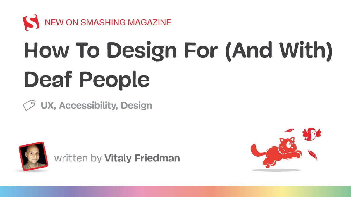
Vitaly Friedman's Smashing Magazine piece dismantles common design misconceptions about deafness, beginning with a calibrated dB spectrum: slight hearing loss starts at 16 dB (up to 10% speech missed beyond 3 feet), moderate loss at 50 dB means missing up to 80% of speech, and profound loss begins at 91 dB. Critically, only around 1% of deaf people in the US know sign language, there is no universal sign language (approximately 300 distinct sign languages exist globally), and lip-reading covers only 30% of words — making written-language-first assumptions equally unreliable since some deaf users have low literacy in spoken-language writing systems. The article distinguishes Deaf (capital D, culturally deaf from birth, sign language as first language) from deaf (lowercase, later-onset) and Hard of Hearing, urging designers to ask individuals how they self-identify rather than applying labels. Practical UX guidelines include mandatory text alternatives for all audible alerts, haptic feedback on mobile, closed captions with named speaker identification, and never requiring phone-only contact. The author's core principle: design with people who have lived experience of exclusion, not just for them.
Ilknur Eren's SitePoint primer establishes the WCAG thresholds for touch target sizing and explains who suffers most when they are violated. WCAG Level AA requires touch targets of at least 24×24 CSS pixels or 24 pixels of spacing between adjacent targets; Level AAA raises that floor to 44×44 CSS pixels for more forgiving interaction. Users most affected include those with motor impairments (Parkinson's disease, cerebral palsy, arthritis), people with low vision who cannot identify button boundaries, and anyone in situational contexts such as wearing gloves or riding a bumpy bus. The article provides a concrete HTML/CSS implementation pattern: wrap small icons (like an SVG like.svg) in a button with a dedicated class setting minimum width and height to 48px and padding to 12px, keeping the visual icon small while the interactive hit area meets requirements. The core design implication is that touch target adequacy is not a niche disability concern — undersized targets create barriers for all users across device types and contexts.
Arin Bhowmick, Chief Design Officer at SAP, draws on enterprise design team collaborations and conference observations to outline ten concrete UX shifts for 2026. The explainable AI market is projected to reach $33.2 billion by 2032, and 88% of business leaders plan to increase AI budgets for agentic capabilities — pressuring designers to build orchestration interfaces that manage agent handoffs and define human-intervention triggers. Gemini 3 Pro can already generate interactive interfaces on demand that match human expert designs 44% of the time, shifting a designer's role toward authoring constraints and safety rails rather than fixed screens. Voice assistant adoption in the US is forecast at 157.1 million users by end of 2026. Two other structural shifts: biometric and FIDO2/passkey authentication is being adopted as default rather than alternative (nearly a third of cybersecurity leaders already implementing passwordless), and micro-interactions have graduated from decorative flourishes to primary communication channels — interfaces lacking them read as unresponsive. Bhowmick flags a key tension in personalization: Netflix-style tracking feels acceptable because users opted in, while cross-site ad tracking using identical technology feels intrusive — the 2026 design challenge is delivering personalization value without covert surveillance.
George, a product designer at Ramp — a spend management company — demonstrates how he uses Magic Patterns as his primary AI prototyping tool for the first 70% of a project lifecycle, preferring it over v0 and Replit because it focuses exclusively on front-end React output and errors far less frequently. Rather than opening Figma first, he builds interactive browser-based prototypes by voice-dictating long prompts, then uses a Chrome extension to capture live Figma components and convert them into Magic Patterns components that approximate Ramp's atomic design system using ShadCN. A concrete example shows a smart transfer-funds form that auto-selects the payment method — switching from real-time payment (capped at $10 million) to wire above that limit — built in roughly an hour. He also uses LogRocket session replays and a Notion AI-powered voice-of-the-customer tool to surface pain points autonomously, and demonstrates a browser-based Ramp Inspect tool that lets him prototype a fix (displaying pending balances) and generate a GitHub PR without opening Cursor. Collaboration remains a gap: Magic Patterns currently lacks in-canvas commenting, so feedback loops run through Slack.
Figma Make: the biggest shift in UX/UI since Sketch
Albertmauri argues that Figma Make, which launched in May 2025 and exited beta in late July, represents a generational shift comparable to Sketch's arrival in 2010 — not because it's technically first, but because designers are already inside Figma, collapsing the adoption barrier to nearly zero. After more than 4,000 personal iterations, the author describes two concrete workflows: a PRD-to-prototype pipeline that uses ChatGPT to convert a requirements document into a Figma Make prompt, and a hi-fi handoff loop where existing Figma frames (up to three at a time) are pasted directly into Make, which then codes pixel-accurate layouts using the published design library. Under the hood, Figma Make defaults to React, Tailwind CSS v4, and ShadCN, adapting ShadCN tokens to match any imported library. The platform also supports Progressive Web App output installable on Android and iOS. The author's key caveat is uncertainty about developer reception: while collaborators currently seem willing to cede front-end work to Make, whether they will fully embrace or resist the shift remains unresolved.
George, a product designer at Ramp — a spend management company — demonstrates how he uses Magic Patterns as his primary AI prototyping tool for the first 70% of a project lifecycle, preferring it over v0 and Replit because it focuses exclusively on front-end React output and errors far less frequently. Rather than opening Figma first, he builds interactive browser-based prototypes by voice-dictating long prompts, then uses a Chrome extension to capture live Figma components and convert them into Magic Patterns components that approximate Ramp's atomic design system using ShadCN. A concrete example shows a smart transfer-funds form that auto-selects the payment method — switching from real-time payment (capped at $10 million) to wire above that limit — built in roughly an hour. He also uses LogRocket session replays and a Notion AI-powered voice-of-the-customer tool to surface pain points autonomously, and demonstrates a browser-based Ramp Inspect tool that lets him prototype a fix (displaying pending balances) and generate a GitHub PR without opening Cursor. Collaboration remains a gap: Magic Patterns currently lacks in-canvas commenting, so feedback loops run through Slack.
Vitaly Friedman's Smashing Magazine piece dismantles common design misconceptions about deafness, beginning with a calibrated dB spectrum: slight hearing loss starts at 16 dB (up to 10% speech missed beyond 3 feet), moderate loss at 50 dB means missing up to 80% of speech, and profound loss begins at 91 dB. Critically, only around 1% of deaf people in the US know sign language, there is no universal sign language (approximately 300 distinct sign languages exist globally), and lip-reading covers only 30% of words — making written-language-first assumptions equally unreliable since some deaf users have low literacy in spoken-language writing systems. The article distinguishes Deaf (capital D, culturally deaf from birth, sign language as first language) from deaf (lowercase, later-onset) and Hard of Hearing, urging designers to ask individuals how they self-identify rather than applying labels. Practical UX guidelines include mandatory text alternatives for all audible alerts, haptic feedback on mobile, closed captions with named speaker identification, and never requiring phone-only contact. The author's core principle: design with people who have lived experience of exclusion, not just for them.
Ilknur Eren's SitePoint primer establishes the WCAG thresholds for touch target sizing and explains who suffers most when they are violated. WCAG Level AA requires touch targets of at least 24×24 CSS pixels or 24 pixels of spacing between adjacent targets; Level AAA raises that floor to 44×44 CSS pixels for more forgiving interaction. Users most affected include those with motor impairments (Parkinson's disease, cerebral palsy, arthritis), people with low vision who cannot identify button boundaries, and anyone in situational contexts such as wearing gloves or riding a bumpy bus. The article provides a concrete HTML/CSS implementation pattern: wrap small icons (like an SVG like.svg) in a button with a dedicated class setting minimum width and height to 48px and padding to 12px, keeping the visual icon small while the interactive hit area meets requirements. The core design implication is that touch target adequacy is not a niche disability concern — undersized targets create barriers for all users across device types and contexts.
Arin Bhowmick, Chief Design Officer at SAP, draws on enterprise design team collaborations and conference observations to outline ten concrete UX shifts for 2026. The explainable AI market is projected to reach $33.2 billion by 2032, and 88% of business leaders plan to increase AI budgets for agentic capabilities — pressuring designers to build orchestration interfaces that manage agent handoffs and define human-intervention triggers. Gemini 3 Pro can already generate interactive interfaces on demand that match human expert designs 44% of the time, shifting a designer's role toward authoring constraints and safety rails rather than fixed screens. Voice assistant adoption in the US is forecast at 157.1 million users by end of 2026. Two other structural shifts: biometric and FIDO2/passkey authentication is being adopted as default rather than alternative (nearly a third of cybersecurity leaders already implementing passwordless), and micro-interactions have graduated from decorative flourishes to primary communication channels — interfaces lacking them read as unresponsive. Bhowmick flags a key tension in personalization: Netflix-style tracking feels acceptable because users opted in, while cross-site ad tracking using identical technology feels intrusive — the 2026 design challenge is delivering personalization value without covert surveillance.
Design discourse enters 2026 dominated by one question: what does AI do to the craft? The featured essay argues Figma Make is the biggest shift in UX/UI tooling since Sketch — written after 4,000+ iterations in the tool, it reads less like hype and more like a field report on how prototype-first, AI-assisted design changes the designer's job description. The same energy runs through Ramp's design-process walkthrough, where prototypes replace wireframes as the starting artifact.
The accessibility thread is strong this week: Vitaly Friedman's guide to designing for (and with) deaf people dismantles the hearing-aid stereotype and offers concrete patterns across the deafness spectrum, while SitePoint's touch-target primer covers the minimum sizes and spacing that quietly decide whether interfaces are usable at all. Arin Bhowmick's ten observed UX shifts for 2026 — explainable AI at the center — close the loop between the AI wave and everyday design practice.
Key Takeaways
Treat AI design tools as a Sketch-scale platform shift: start from prototypes, not wireframes, and iterate in the tool.
Design for the deafness spectrum — captions, visual affordances, and co-design beat assumptions about hearing aids.
Touch-target size and spacing are accessibility fundamentals; audit them before shipping any new component.