articleTAG: TOOLINGREAD_TIME: 6_MIN
Penpot Is Experimenting With MCP Servers For AI-Powered Design Workflows
Penpot, the open-source design platform, is actively experimenting with MCP (Model Context Protocol) servers as a secure bridge between LLMs and its API, enabling AI to perform real design operations rather than simple generate-from-description prompts. Because Penpot expresses designs as code, the MCP server can programmatically create, edit, analyze, and export design elements with granularity unavailable to competing tools — a capability demonstrated live at Penpot Fest 2025 by designer Juan de la Cruz García and Oraios AI co-founder Dominik Jain using Claude Desktop. The server is LLM-agnostic (tested with Claude in VS Code, Cursor, Claude Desktop, and JetBrains Rider with Junie AI) and includes a Python SDK, REST API, plugin system, and CLI tools. Supported use cases range from design-to-code, code-to-design, and design-to-Storybook generation to accessibility analysis, visual regression testing, and design-system compliance checking. The project has not yet reached beta, but Penpot is recruiting volunteer testers via support@penpot.app.
TAG: ACCESSIBILITYREAD_TIME: 6_MIN
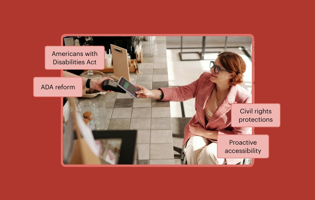
ADA Reform and the Path to a True Win-Win for Businesses and People With Disabilities
Deque examines proposed U.S. legislation — including the ADA 30 Days to Comply Act, co-sponsored by Congressman Mike Lawler — that would add notice-and-cure requirements before ADA enforcement action can proceed. The post argues that while reducing bad-faith litigation is a legitimate goal, framing accessibility barriers as surprises misrepresents the systemic nature of most failures: inaccessible third-party platforms, reused templates, and absent governance practices, not individual oversights. Notice-and-cure provisions shift the burden onto people with disabilities, who must first identify and formally report violations before the law protects their access — an especially acute harm in time-sensitive digital contexts such as job applications or healthcare information. Instead, Deque advocates for clear stable technical standards, good-faith safe harbors tied to ongoing compliance, affordable tooling, and procurement accountability. The post advises businesses hit by accessibility lawsuits to engage ADA-experienced legal counsel and a qualified accessibility expert immediately to build a documented remediation plan.
TAG: TOOLINGREAD_TIME: 7_MIN
From Figma Smart Animate to React: The Real Pipeline
Carmen Ansio, presenting at Figma Config 2025 in San Francisco, documents the two-problem split at the heart of Figma-to-code animation handoff: preserving complex authored motion (timing, easing curves, frame sequences) versus wiring interaction logic (state machines, event handlers) to React. Her answer is a deliberate tool split: dotLottie handles animation exported from Figma via the LottieFiles Figma plugin, which captures Smart Animate transitions including easing, duration, opacity, scale, and position; Framer Motion handles all React-state-driven interactivity such as AnimatePresence character transitions and hover/tap scale responses. The @lottiefiles/dotlottie-web package (not lottie-web) uses a WebAssembly renderer drawing to <canvas> for performance, requiring the WASM binary in the Vite public/ folder. A key implementation detail: multiple dotLottie animations for the same component each need their own <canvas> element — swapping src on a single instance causes a loading flash — with CSS opacity transitions for the crossfade. Known export pitfalls include nested component state flattening, variable font text properties, and Figma Spring easing approximated as cubic bezier.
TAG: CSS FEATUREREAD_TIME: 2_MIN
Focus Rings With Nested contrast-color()?
Dave Rupert explores whether nesting CSS contrast-color() — as in contrast-color(contrast-color(var(--page-bg))) — can replace the two-token focus-ring pattern (a --focus-inner-ring and --focus-outer-ring) used in Microsoft's Fluent design system, which combines a 1 px inset white highlight with a 2 px offset black outline to guarantee contrast against arbitrary backgrounds like blue buttons. The nested call inverts the return value of contrast-color(), theoretically reducing the required tokens from two themed pairs down to a single existing --page-bg token. He identifies a key caveat: the trick fails when focus rings appear over surfaces that differ from --page-bg, such as card backgrounds. Rupert ultimately recommends color-scheme and light-dark() instead — e.g., light-dark(white, black) for the inner ring and light-dark(black, white) for the outer — because browser support for contrast-color() is still spotty and light-dark() keeps the code readable and simple.
TAG: PROCESSREAD_TIME: 11_MIN
Why Most Product Teams Aren't Really Empowered
Laura Klein at Nielsen Norman Group argues that genuine team empowerment — per Marty Cagan's definition in his 2020 book Empowered, meaning teams are given problems not features and have authority over solutions — is structurally incompatible with how most large organizations work. Four compounding dysfunctions are examined: shared systems and components force costly multi-team coordination (one fintech PM spent three months and 14 meetings on a single nav change, producing a 47-page document); org charts structured around engineering boundaries rather than user journeys leave teams owning only a rectangle of a screen; inherent product interdependencies block even well-structured teams, as illustrated by a healthcare marketplace where provider scheduling, patient booking, and notifications teams deadlocked; and executive demand for roadmap certainty directly conflicts with the iterative discovery empowered teams need. Klein offers practical tactics — minimizing cross-team dependencies when choosing problems, visualizing full user journeys, building inter-team relationships proactively — while acknowledging that at organizational scale, PMs often become coordination overhead rather than strategic thinkers.
TAG: ACCESSIBILITYREAD_TIME: 6_MIN
Common Misconceptions About Testing Accessibility
Authored by Ela Gorla at TetraLogical, this post identifies five persistent misconceptions that undermine effective accessibility testing in digital teams. The most consequential: automated tools can only detect 20–40% of WCAG requirements, yet many teams treat them as comprehensive audits; and testing is still routinely deferred to QA at project completion despite the higher remediation cost of late-stage fixes. Gorla argues that every role — designer, developer, content writer, media producer — carries accessibility testing responsibility specific to their discipline, rather than delegating it solely to specialists. The post also cautions against over-relying on disability user panels alone, citing WCAG SC 1.4.10 (Reflow, requiring content to reflow at 320 CSS pixels width) as an example of a requirement that panels rarely cover. The WebAIM Screen Reader User Survey is recommended for prioritizing which AT/browser/OS combinations to test.
summarizeDigest_Summary
Week 2's design systems story is anchored by a genuinely novel signal: Penpot is experimenting with MCP servers as a programmatic bridge between LLMs and its design API, enabling AI to perform real design operations rather than generating from prose descriptions. Because Penpot expresses designs as code, the MCP layer gets the granularity that competing tools cannot match — demonstrated live at Penpot Fest 2025 using Claude Desktop, and already tested across VS Code, Cursor, and JetBrains Rider. The system supports design-to-code, code-to-design, Storybook generation, accessibility analysis, and design-system compliance checking, all from an LLM-agnostic Python SDK. It has not reached beta yet, but the architecture is a preview of how design tooling integrates with the agentic layer.
The accessibility thread this week has two distinct registers. Ela Gorla at TetraLogical dismantles five misconceptions that quietly undermine team-wide accessibility testing: automated tools only catch 20–40% of WCAG requirements yet are routinely treated as comprehensive audits, testing is still deferred to project-end QA despite the remediation cost of late fixes, and responsibility is still too often delegated to specialists rather than distributed across designers, developers, and content writers. The WebAIM Screen Reader User Survey is recommended for prioritizing which AT/browser/OS combinations to actually test. Alongside this, the Deque analysis of U.S. ADA reform legislation — specifically the ADA 30 Days to Comply Act — argues that notice-and-cure provisions shift the legal burden onto disabled users who must first identify and report violations before protections apply, a structurally problematic inversion in time-sensitive digital contexts like job applications or healthcare information.
Dave Rupert's investigation into nested contrast-color() for focus rings is the week's clearest example of CSS feature composition pushed to its edge: the nested call theoretically reduces a two-token pattern (--focus-inner-ring and --focus-outer-ring) down to a single --page-bg token, but fails when focus rings appear over surfaces that differ from the page background. His recommendation to fall back to light-dark() with explicit values is pragmatic given spotty contrast-color() browser support. Carmen Ansio's Figma Config 2025 talk documenting the dotLottie/Framer Motion pipeline for React animation handoff closes the week — dotLottie via WebAssembly canvas rendering for motion fidelity, Framer Motion for state-driven interactivity, with a critical implementation note that multiple animations per component each need their own <canvas> element to avoid loading flashes.
Key Takeaways- Evaluate Penpot's MCP server experiment as a template for design-to-code automation: the LLM-agnostic architecture means the same server could wire to whichever model your team already uses.
- Distribute accessibility testing responsibility across every discipline now — automated tooling catches at most 40% of WCAG requirements, and retrofitting late-stage failures costs dramatically more than building in the checks from the start.
- In Figma-to-React animation pipelines, give each dotLottie animation its own dedicated
<canvas> element and use CSS opacity transitions for crossfades — swapping src on a single instance causes a loading flash.