Accessibility took center stage in design systems this week. Elle Smith's guide on accessible focus indicators — this week's featured piece — provides concrete,… Compiled for immediate developer deployment.
calendar_todaysummarizeWeek 10-2026
article
TAG: ACCESSIBILITYREAD_TIME: 9_MIN
A guide to accessible focus indicators - Pope Tech Resources
Elle Smith's guide frames missing focus indicators as navigating with an invisible cursor, then delivers concrete design rules. Contrast must hit at least 3:1 against both the page background and the element's unfocused state. Size must reach a minimum of 2px — with insets requiring even more to compensate for the ring covering part of the element. Common CSS pitfalls get specific fixes: use :focus-visible to avoid showing rings on mouse clicks, scroll-margin-top to prevent sticky-header overlap, and a transparent outline fallback to survive Windows High Contrast Mode. Pope Tech's own site is held up as a case study, demonstrating distinct indicator designs for navigation links, CTA buttons, and card components simultaneously.
Part 15 of the "Design Tokens Workflow" series tackles a rarely systematized layer: microcopy — button labels, form hints, error messages, and empty states. The W3C DTCG spec has no string or content token type, so the author's workaround sets $type: number at the group level and uses $extensions to flag actual microcopy tokens, keeping files valid while signaling intent. Style Dictionary then filters on the extension to emit both JavaScript objects and JSON from a single source. Token files are organized by context — copy-button.tokens.json, copy-form.tokens.json, copy-error.tokens.json — and React component examples show semantic references replacing hardcoded strings. Internationalization follows the same layering pattern used for theming: language-specific token files override values and a build-i18n.js script produces locale-namespaced output bundles.
Figma Code to Canvas: What the Demo Didn't Show You - The Miners
Edy Silva dissects the Figma-Anthropic Code to Canvas integration announced February 17, 2026, going well beyond the polished demo. Setup takes two minutes — one claude mcp add command to register Figma's remote MCP server, then OAuth. "Send this to Figma" triggers Claude calling generate_figma_design, injecting a capture script via a special URL hash, and polling until a shareable Figma link appears in under a minute. Real-world tests exposed two recurring edge cases: scroll-triggered animations (IntersectionObserver) simply don't appear in the capture, requiring a temporary hook patch; and fixed sidebars render at viewport height while scrollable main content exceeds it, leaving a truncated sidebar in the resulting frame. CSS gradient text also converts to flat color. Silva finds the Figma-to-code direction — pasting a Figma link and asking Claude to implement it — more immediately practical for daily dev work.
Your skip link targets may not need tabindex=-1 to work properly - Manuel Matuzovic
Manuel Matuzović challenges the long-standing practice of adding tabindex="-1" to skip-link targets like main. The underlying issue — focus staying on the link after Enter instead of advancing to the target — was resolved by browsers via a feature called Sequential Focus Navigation Starting Point (SFNSP). Firefox fixed it in 2013, Chrome in 2016. Matuzović ran cross-browser tests covering Firefox 157, Chrome 145, Safari, and Edge on both macOS 26.3 and Windows 11, plus screen readers VoiceOver, JAWS 2026, NVDA 2025.3.3, Narrator, and TalkBack on Android 16 — all confirmed correct behavior without tabindex. A bonus warning: Dan Burzo found that tabindex="-1" on maincan break the iOS back button. The :target CSS pseudo-class can style the landing element without focus.
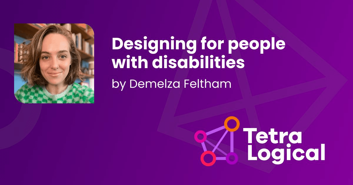
Designing for people with disabilities - TetraLogical
Demelza Feltham at TetraLogical argues that WCAG compliance is necessary but insufficient: the Inclusive Design Principles ask not how to implement contrast or keyboard access, but whether a complex multi-step form should exist at all. The article frames disability across three axes — permanent, temporary, and situational — and points out that many design decisions overlap positively across disability types: clear predictable journeys aid both blind users and those with cognitive disabilities; meaningful feedback benefits low-vision and reading-impaired users alike. A case study of Steve, a deaf-low-vision London photographer, illustrates how intersecting disabilities demand intersecting design decisions. The post closes by positioning accessible design systems as the mechanism for locking inclusive defaults in rather than patching them retroactively.
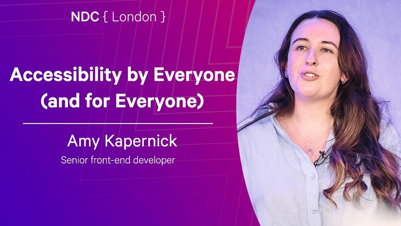
Accessibility by Everyone (and for Everyone) - Amy Kapernick - NDC London 2026
Amy Kapernick's NDC London 2026 talk frames accessibility as a cross-functional responsibility spanning company leadership, HR, product, design, development, QA, and DevOps — not a specialist silo. She categorizes impairments as permanent, temporary, or situational, then cites the 2025 WebAIM Million audit: 94.8% of tested homepages failed accessibility guidelines, averaging 51 errors each, yet 96% of those errors fall into five easy-fix categories — low contrast, missing alt text, empty buttons/links, unlabeled form inputs, and missing document language. Kapernick calls out accessibility overlays as a harmful non-solution, warns against MFA time limits that disadvantage screen reader users, and recommends combining automated pipeline tests (color contrast, HTML validation) with user testing by people who rely on assistive technology daily. The European Accessibility Act (June 2025), based on WCAG 2.2 Level AA, is raised as a compliance floor that affects any product serving EU customers.
A guide to accessible focus indicators - Pope Tech Resources
Elle Smith's guide frames missing focus indicators as navigating with an invisible cursor, then delivers concrete design rules. Contrast must hit at least 3:1 against both the page background and the element's unfocused state. Size must reach a minimum of 2px — with insets requiring even more to compensate for the ring covering part of the element. Common CSS pitfalls get specific fixes: use :focus-visible to avoid showing rings on mouse clicks, scroll-margin-top to prevent sticky-header overlap, and a transparent outline fallback to survive Windows High Contrast Mode. Pope Tech's own site is held up as a case study, demonstrating distinct indicator designs for navigation links, CTA buttons, and card components simultaneously.
Accessibility by Everyone (and for Everyone) - Amy Kapernick - NDC London 2026
Amy Kapernick's NDC London 2026 talk frames accessibility as a cross-functional responsibility spanning company leadership, HR, product, design, development, QA, and DevOps — not a specialist silo. She categorizes impairments as permanent, temporary, or situational, then cites the 2025 WebAIM Million audit: 94.8% of tested homepages failed accessibility guidelines, averaging 51 errors each, yet 96% of those errors fall into five easy-fix categories — low contrast, missing alt text, empty buttons/links, unlabeled form inputs, and missing document language. Kapernick calls out accessibility overlays as a harmful non-solution, warns against MFA time limits that disadvantage screen reader users, and recommends combining automated pipeline tests (color contrast, HTML validation) with user testing by people who rely on assistive technology daily. The European Accessibility Act (June 2025), based on WCAG 2.2 Level AA, is raised as a compliance floor that affects any product serving EU customers.
Part 15 of the "Design Tokens Workflow" series tackles a rarely systematized layer: microcopy — button labels, form hints, error messages, and empty states. The W3C DTCG spec has no string or content token type, so the author's workaround sets $type: number at the group level and uses $extensions to flag actual microcopy tokens, keeping files valid while signaling intent. Style Dictionary then filters on the extension to emit both JavaScript objects and JSON from a single source. Token files are organized by context — copy-button.tokens.json, copy-form.tokens.json, copy-error.tokens.json — and React component examples show semantic references replacing hardcoded strings. Internationalization follows the same layering pattern used for theming: language-specific token files override values and a build-i18n.js script produces locale-namespaced output bundles.
Figma Code to Canvas: What the Demo Didn't Show You - The Miners
Edy Silva dissects the Figma-Anthropic Code to Canvas integration announced February 17, 2026, going well beyond the polished demo. Setup takes two minutes — one claude mcp add command to register Figma's remote MCP server, then OAuth. "Send this to Figma" triggers Claude calling generate_figma_design, injecting a capture script via a special URL hash, and polling until a shareable Figma link appears in under a minute. Real-world tests exposed two recurring edge cases: scroll-triggered animations (IntersectionObserver) simply don't appear in the capture, requiring a temporary hook patch; and fixed sidebars render at viewport height while scrollable main content exceeds it, leaving a truncated sidebar in the resulting frame. CSS gradient text also converts to flat color. Silva finds the Figma-to-code direction — pasting a Figma link and asking Claude to implement it — more immediately practical for daily dev work.
Your skip link targets may not need tabindex=-1 to work properly - Manuel Matuzovic
Manuel Matuzović challenges the long-standing practice of adding tabindex="-1" to skip-link targets like main. The underlying issue — focus staying on the link after Enter instead of advancing to the target — was resolved by browsers via a feature called Sequential Focus Navigation Starting Point (SFNSP). Firefox fixed it in 2013, Chrome in 2016. Matuzović ran cross-browser tests covering Firefox 157, Chrome 145, Safari, and Edge on both macOS 26.3 and Windows 11, plus screen readers VoiceOver, JAWS 2026, NVDA 2025.3.3, Narrator, and TalkBack on Android 16 — all confirmed correct behavior without tabindex. A bonus warning: Dan Burzo found that tabindex="-1" on maincan break the iOS back button. The :target CSS pseudo-class can style the landing element without focus.
Designing for people with disabilities - TetraLogical
Demelza Feltham at TetraLogical argues that WCAG compliance is necessary but insufficient: the Inclusive Design Principles ask not how to implement contrast or keyboard access, but whether a complex multi-step form should exist at all. The article frames disability across three axes — permanent, temporary, and situational — and points out that many design decisions overlap positively across disability types: clear predictable journeys aid both blind users and those with cognitive disabilities; meaningful feedback benefits low-vision and reading-impaired users alike. A case study of Steve, a deaf-low-vision London photographer, illustrates how intersecting disabilities demand intersecting design decisions. The post closes by positioning accessible design systems as the mechanism for locking inclusive defaults in rather than patching them retroactively.
Accessibility took center stage in design systems this week. Elle Smith's guide on accessible focus indicators — this week's featured piece — provides concrete, WCAG-backed rules: minimum 3:1 contrast against both background and unfocused state, at least 2px thickness (more for insets), and three CSS fixes that are regularly missed in practice: :focus-visible to suppress mouse-click rings, scroll-margin-top for sticky-header interference, and a transparent outline fallback for Windows High Contrast Mode.
Two broader accessibility articles reinforce why these details matter at the system level. TetraLogical argues that WCAG compliance is a floor, not a ceiling, and that design systems are the right mechanism for locking in inclusive defaults across teams. Amy Kapernick's NDC London talk quantifies the cost of neglect — 94.8% of tested homepages fail, with 96% of errors falling into five trivially fixable categories — and frames accessibility as a full-team responsibility, not a specialist silo. The European Accessibility Act (WCAG 2.2 AA, June 2025) adds a legal urgency for products serving EU customers.
Rounding out the week, Manuel Matuzovic challenges the long-standing tabindex="-1" convention on skip-link targets, backed by cross-browser and screen reader evidence showing it is unnecessary since 2013/2016 and can actively break iOS back-navigation. The design-tokens series contributes a microcopy workflow using Style Dictionary, and an in-depth look at the Figma Code to Canvas integration reveals real-world edge cases the polished demo glossed over.
Key Takeaways
Accessible focus indicators need at least 3:1 contrast and 2px thickness — :focus-visible, scroll-margin-top, and a transparent outline cover the three most common implementation gaps.
The European Accessibility Act (WCAG 2.2 AA) is now law for EU-facing products; 96% of homepage errors fall into five easily fixable categories, making compliance achievable with targeted effort.
tabindex="-1" on skip-link targets is no longer necessary in any modern browser and can break the iOS back button — remove it unless supporting very old environments.