Week 14 featured a cluster of complementary design-system articles from Netguru, grounding abstract concepts in concrete numbers. Their comparison of design… Compiled for immediate developer deployment.
calendar_todaysummarizeWeek 14-2026
article
TAG: PATTERNSREAD_TIME: 8_MIN
Design System Patterns: Essential Building Blocks for Scalable UI
Design system patterns are reusable combinations of components that solve recurring user problems — distinct from individual components, which are unfinished building blocks named as nouns. The article categorizes four core pattern types: navigation (horizontal bars, breadcrumbs, hamburger menus), form and input (single-column layouts, inline validation, calendar pickers), data display (sortable tables, dashboard stat components), and feedback and status (loading indicators, error notifications). Concrete examples include login and authentication flows, multi-step forms with progress indicators capped at five fields per step, empty state designs, search-and-filter systems, and card layouts. The Silk design system is cited as a model, with predefined patterns for commerce scenarios including checkout flows and product listings. Adoption strategy draws on Delivery Hero's three-component approach: gamify, socialize, and celebrate milestones.
Squarespace & Web Standards: How We Helped Bring HTML Video & Audio Lazy Loading to Today's Browsers
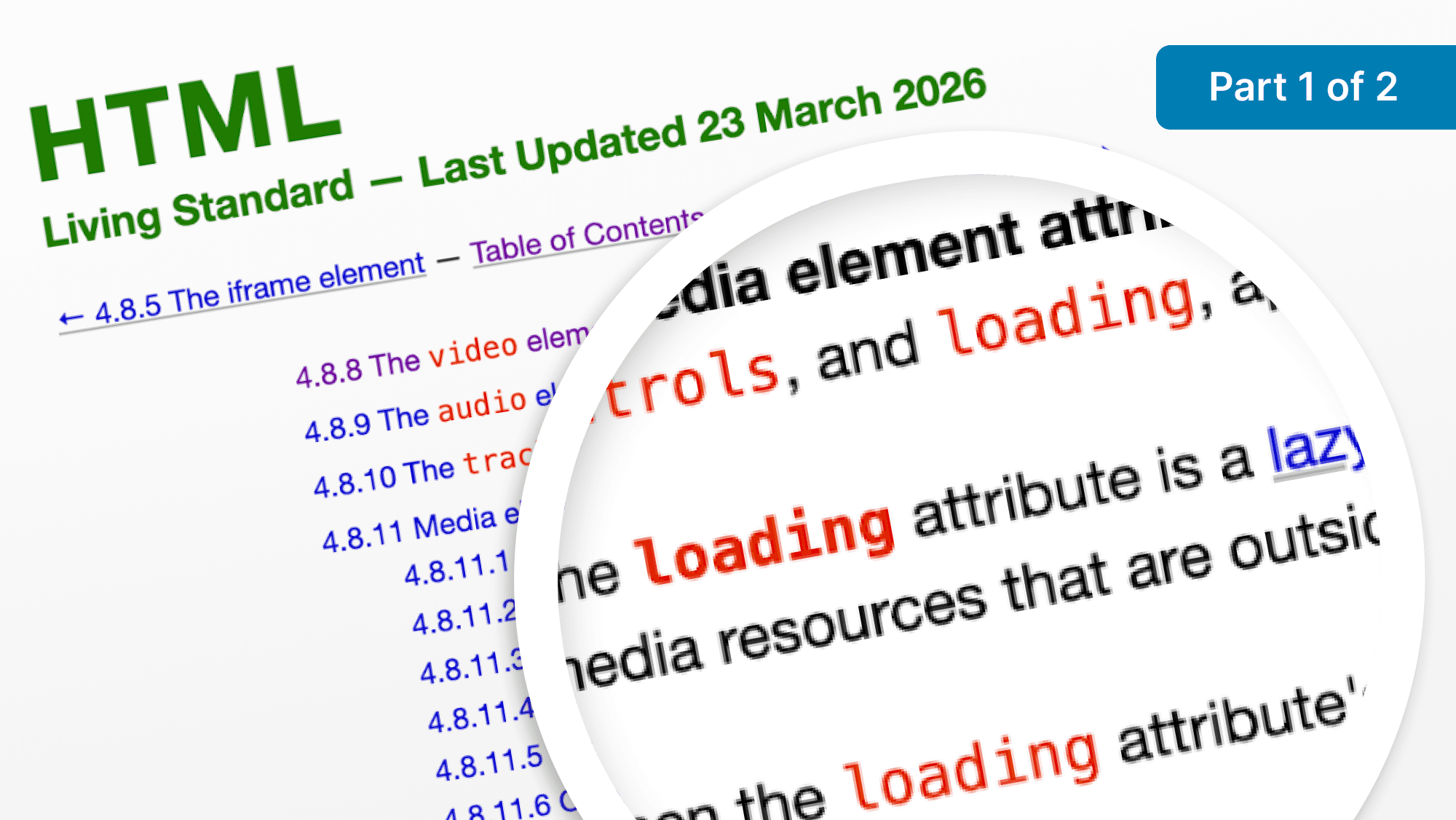
A small team of Squarespace engineers spent hack week prototyping and ultimately shipping loading="lazy" support for the HTML video and audio elements — a feature that has existed for img and iframe since 2019 but was absent for media elements, leaving developers reliant on JavaScript workarounds. The team contributed a pull request to the WHATWG HTML Standard (endorsed by Mozilla, Apple, and Chromium code owners), over 30 Web Platform Tests merged in February, browser patches for Firefox and WebKit, and collaborated with Helmut Januschka on a Chromium implementation that shipped in Chrome 147 beta on March 11 and reached GA on April 7, with default enablement planned for Chrome 148 (May 5). The spec also covers deferring autoplay and poster image loading when the attribute is present. The article is part one of a two-part series and includes guidance for engineers new to browser contribution, citing Mozilla's Firefox Contributor Quick Reference, WebKit's guide, and Monica Dinculescu's Chromium primer.
How to Build a Design System Roadmap That Actually Gets Adopted
This guide outlines a five-area framework for building a design system roadmap that teams actually use. It starts with visual foundations: building a numeric color scale (primary at 500, darks 600-900, tints 400-50 as adopted by Tailwind and Material Design), defining a 13-style typography scale, and setting spacing tokens on an 8px base unit. Component inventory comes next — the article recommends quarterly audits for high-velocity teams and six-month audits for growth-stage companies, with components prioritized by usage frequency, complexity, and accessibility impact. Documentation templates should require component name, visual examples, usage guidelines, behavior specifications, and code snippets. Governance choices span centralized (single DesignOps team) versus federated (multi-team contribution) models, with semantic versioning (major/minor/patch) for releases. The tracking framework uses Jira with Google Sheets integration, daily standups, Figma changelogs, and cloud-based repositories that increase team productivity by 40%.
Design System vs. Style Guide: A Practical Comparison
This comparison clarifies the distinct roles of design systems, style guides, and component libraries, and helps teams choose the right tool for their project maturity. Design systems comprise design tokens, component libraries, and pattern libraries, delivering dynamic code-driven documentation and cross-functional collaboration — organizations with mature systems report 34% higher productivity and 33% fewer design-related errors. Style guides, by contrast, focus on static visual and editorial standards: colors (HEX, CMYK, Pantone), typography, logo rules, and brand voice, as illustrated by Starbucks and Spotify. Netguru's Silk design system sits in a practical middle ground, reducing setup and prototyping time by 50% and cutting MVP design time from six months to three. The article recommends style guides for small teams or single products, full design systems for enterprise and multi-product scenarios, and a hybrid migration path: start with design tokens, build reusable components, then add governance.
Emojis and icons present unique accessibility challenges because they are not true images — emojis are Unicode picture characters with predefined names that screen readers announce literally (e.g., the prayer hands emoji is read as "Hands pressed together"), while icons are often SVGs or font glyphs that lack inherent accessible names. The article covers three remediation techniques: the visible text method (placing text next to the symbol and hiding the icon with aria-hidden="true"), the screen-reader-only method (using a visually hidden CSS span to replace the literal announcement), and the aria-label method for icon-only buttons (labeling the button element and hiding the SVG with aria-hidden). Key rules include keeping aria-labels to five words or fewer, adding role="img" to non-semantic elements that receive an aria-label, and writing labels based on function rather than shape ("Add to Favorites" not "Heart"). For social media and email where HTML cannot be edited, the guide advises placing emojis at the end of sentences and writing meaning explicitly into surrounding text.
Design principles are guidelines that teams apply by default — without debate — to align around shared values and guard against ad-hoc, inconsistent decisions. Vitaly Friedman frames them as a counterweight to AI-generated design slop, arguing that without explicit principles, product initiatives become random and feel vague to users. He references Dieter Rams' 10 principles for Braun as a model of humble, tangible, non-visionary guidelines, alongside examples from Anthropic's Constitution, Linear's Agentic Design Principles, and Heydon Pickering's Principles of Web Accessibility. For teams establishing their own, the article describes an 8-step workshop adapted from Marcin Treder and Maria Meireles: pre-session user research, product analogy exercises, silent individual principle writing, attribute grouping, linking to real user pain points, drafting "We want X because of Y" value statements, removing analogies to form durable rules, and a reality check against existing products. Figma and FigJam templates from Maria Meireles and Richard Picot are listed as starter kits.
7 Senior Designers Show How They Avoid AI Design Slop
Host Jay interviews seven senior designers from Firefox, Intercom, Shopify, DuckDuckGo, Webflow, and other companies about their pre-design inspiration workflows in an era when AI tools produce generic, homogeneous output. Mobbin emerges as the unanimous go-to — used for studying real production flows, UI elements, dark mode patterns, and motion (its recently added video capture is highlighted as a game-changer for motion design research). Shopify's designer demos their internal "Studio" platform, a Dribbble-like space for sharing design explorations. Other tools cited include MyMind for personal taste-building, Pinterest for mood and aesthetics, layers.to, and X (Twitter) bookmarks. A recurring theme is annotation discipline: designers emphasize cropping and highlighting specific elements in Figma or FigJam moodboards rather than dumping raw screenshots, making inspiration useful for collaborators and code agents alike. The central argument is that deliberate taste cultivation — absorbing high-quality reference daily — is the main differentiator when AI raises the baseline to a generic seven out of ten.
Design System Patterns: Essential Building Blocks for Scalable UI
Design system patterns are reusable combinations of components that solve recurring user problems — distinct from individual components, which are unfinished building blocks named as nouns. The article categorizes four core pattern types: navigation (horizontal bars, breadcrumbs, hamburger menus), form and input (single-column layouts, inline validation, calendar pickers), data display (sortable tables, dashboard stat components), and feedback and status (loading indicators, error notifications). Concrete examples include login and authentication flows, multi-step forms with progress indicators capped at five fields per step, empty state designs, search-and-filter systems, and card layouts. The Silk design system is cited as a model, with predefined patterns for commerce scenarios including checkout flows and product listings. Adoption strategy draws on Delivery Hero's three-component approach: gamify, socialize, and celebrate milestones.
7 Senior Designers Show How They Avoid AI Design Slop
Host Jay interviews seven senior designers from Firefox, Intercom, Shopify, DuckDuckGo, Webflow, and other companies about their pre-design inspiration workflows in an era when AI tools produce generic, homogeneous output. Mobbin emerges as the unanimous go-to — used for studying real production flows, UI elements, dark mode patterns, and motion (its recently added video capture is highlighted as a game-changer for motion design research). Shopify's designer demos their internal "Studio" platform, a Dribbble-like space for sharing design explorations. Other tools cited include MyMind for personal taste-building, Pinterest for mood and aesthetics, layers.to, and X (Twitter) bookmarks. A recurring theme is annotation discipline: designers emphasize cropping and highlighting specific elements in Figma or FigJam moodboards rather than dumping raw screenshots, making inspiration useful for collaborators and code agents alike. The central argument is that deliberate taste cultivation — absorbing high-quality reference daily — is the main differentiator when AI raises the baseline to a generic seven out of ten.
Squarespace & Web Standards: How We Helped Bring HTML Video & Audio Lazy Loading to Today's Browsers
A small team of Squarespace engineers spent hack week prototyping and ultimately shipping loading="lazy" support for the HTML video and audio elements — a feature that has existed for img and iframe since 2019 but was absent for media elements, leaving developers reliant on JavaScript workarounds. The team contributed a pull request to the WHATWG HTML Standard (endorsed by Mozilla, Apple, and Chromium code owners), over 30 Web Platform Tests merged in February, browser patches for Firefox and WebKit, and collaborated with Helmut Januschka on a Chromium implementation that shipped in Chrome 147 beta on March 11 and reached GA on April 7, with default enablement planned for Chrome 148 (May 5). The spec also covers deferring autoplay and poster image loading when the attribute is present. The article is part one of a two-part series and includes guidance for engineers new to browser contribution, citing Mozilla's Firefox Contributor Quick Reference, WebKit's guide, and Monica Dinculescu's Chromium primer.
How to Build a Design System Roadmap That Actually Gets Adopted
This guide outlines a five-area framework for building a design system roadmap that teams actually use. It starts with visual foundations: building a numeric color scale (primary at 500, darks 600-900, tints 400-50 as adopted by Tailwind and Material Design), defining a 13-style typography scale, and setting spacing tokens on an 8px base unit. Component inventory comes next — the article recommends quarterly audits for high-velocity teams and six-month audits for growth-stage companies, with components prioritized by usage frequency, complexity, and accessibility impact. Documentation templates should require component name, visual examples, usage guidelines, behavior specifications, and code snippets. Governance choices span centralized (single DesignOps team) versus federated (multi-team contribution) models, with semantic versioning (major/minor/patch) for releases. The tracking framework uses Jira with Google Sheets integration, daily standups, Figma changelogs, and cloud-based repositories that increase team productivity by 40%.
Design System vs. Style Guide: A Practical Comparison
This comparison clarifies the distinct roles of design systems, style guides, and component libraries, and helps teams choose the right tool for their project maturity. Design systems comprise design tokens, component libraries, and pattern libraries, delivering dynamic code-driven documentation and cross-functional collaboration — organizations with mature systems report 34% higher productivity and 33% fewer design-related errors. Style guides, by contrast, focus on static visual and editorial standards: colors (HEX, CMYK, Pantone), typography, logo rules, and brand voice, as illustrated by Starbucks and Spotify. Netguru's Silk design system sits in a practical middle ground, reducing setup and prototyping time by 50% and cutting MVP design time from six months to three. The article recommends style guides for small teams or single products, full design systems for enterprise and multi-product scenarios, and a hybrid migration path: start with design tokens, build reusable components, then add governance.
Emojis and icons present unique accessibility challenges because they are not true images — emojis are Unicode picture characters with predefined names that screen readers announce literally (e.g., the prayer hands emoji is read as "Hands pressed together"), while icons are often SVGs or font glyphs that lack inherent accessible names. The article covers three remediation techniques: the visible text method (placing text next to the symbol and hiding the icon with aria-hidden="true"), the screen-reader-only method (using a visually hidden CSS span to replace the literal announcement), and the aria-label method for icon-only buttons (labeling the button element and hiding the SVG with aria-hidden). Key rules include keeping aria-labels to five words or fewer, adding role="img" to non-semantic elements that receive an aria-label, and writing labels based on function rather than shape ("Add to Favorites" not "Heart"). For social media and email where HTML cannot be edited, the guide advises placing emojis at the end of sentences and writing meaning explicitly into surrounding text.
Design principles are guidelines that teams apply by default — without debate — to align around shared values and guard against ad-hoc, inconsistent decisions. Vitaly Friedman frames them as a counterweight to AI-generated design slop, arguing that without explicit principles, product initiatives become random and feel vague to users. He references Dieter Rams' 10 principles for Braun as a model of humble, tangible, non-visionary guidelines, alongside examples from Anthropic's Constitution, Linear's Agentic Design Principles, and Heydon Pickering's Principles of Web Accessibility. For teams establishing their own, the article describes an 8-step workshop adapted from Marcin Treder and Maria Meireles: pre-session user research, product analogy exercises, silent individual principle writing, attribute grouping, linking to real user pain points, drafting "We want X because of Y" value statements, removing analogies to form durable rules, and a reality check against existing products. Figma and FigJam templates from Maria Meireles and Richard Picot are listed as starter kits.
Week 14 featured a cluster of complementary design-system articles from Netguru, grounding abstract concepts in concrete numbers. Their comparison of design systems versus style guides clarified that mature systems deliver 34% higher productivity and 33% fewer design-related errors, and that the Silk design system specifically cut MVP design time from six months to three and setup time by 50%. The roadmap guide prescribed a numeric color scale (primary at 500, darks 600–900, tints 400–50 — the same convention used by Tailwind and Material Design), a 13-style typography scale, and an 8px base spacing token, with governance options ranging from centralized DesignOps to federated multi-team contribution models tracked via Jira with Google Sheets integration.
On the operational side, the design patterns article identified four core pattern categories — navigation, form and input, data display, and feedback and status — and cited Delivery Hero's adoption strategy of gamify, socialize, and celebrate milestones. The accessibility piece from pope.tech gave precise remediation techniques for emojis and icons: using aria-hidden="true" with visible text, visually-hidden CSS spans, or aria-label on icon-only buttons with role="img", while recommending labels of five words or fewer based on function rather than shape.
Smashing Magazine's design principles guide, authored by Vitaly Friedman, framed explicit principles as a defense against AI-generated design homogeneity, referencing Dieter Rams'10 Braun principles, Linear's Agentic Design Principles, and Anthropic's Constitution as models. An 8-step workshop adapted from Marcin Treder and Maria Meireles gives teams a practical path from user research to durable written rules.
Key Takeaways
Mature design systems deliver measurable ROI: Netguru's Silk cut MVP design time from 6 months to 3 and setup time by 50%, while organizations with full systems report 34% higher productivity.
The four core pattern categories — navigation, form and input, data display, and feedback and status — are the reusable building blocks that distinguish a design system from a component library.
Explicit design principles counter AI design homogeneity: Dieter Rams, Linear's Agentic Design Principles, and Anthropic's Constitution are cited as models for writing humble, function-grounded rules.