articleTAG: AI + TOKENSREAD_TIME: 8_MIN
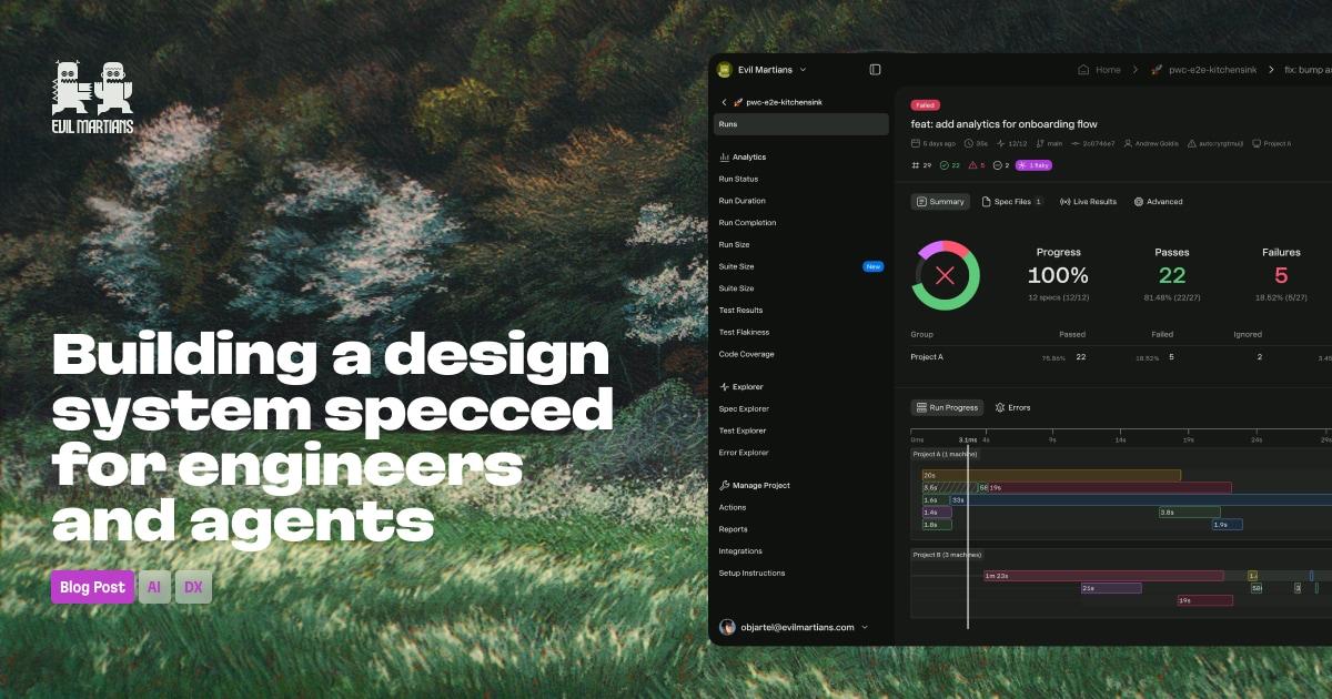
Building a Design System Specced for Engineers and Agents
Evil Martians built a complete design system for Currents, a test observability platform, in just seven weeks using an AI-assisted audit of 791 files. The audit surfaced 236 unique colors with 1,413 usages, two competing font systems, and parallel icon libraries. The resulting system collapses colors into four semantic token groups — elevation, content, UI, and border — all defined in OKLCH so that AI agents can extend the palette predictably without drifting. Typography is consolidated into six sizes and five token groups, including a dedicated UI group with a single correct token for button labels. Icons migrated from legacy sets via an AI-generated lookup table with 90% accuracy using the Figura One set wrapped with SVGR. The system lives in Figma, Storybook, and GitHub, designed to be readable by both engineers and LLMs without a designer in the loop.
TAG: ACCESSIBILITYREAD_TIME: 6_MIN
Automating Colour Contrast With Design Tokens
This article, part of an ongoing design tokens workflow series, demonstrates how to automate WCAG-compliant color contrast generation at build time using Style Dictionary and colorjs.io. The system relies on a naming convention where tokens ending in -background trigger automatic generation of corresponding -foreground-aa and -foreground-aaa tokens, always choosing from black or white to guarantee AA compliance. Developers may also define a custom foreground color; the build reports its compliance ratio and marks it with a visual pass/fail indicator in the generated CSS comments. A configurable transform accepts custom backgroundTokenName and foregroundTokenName values so the system adapts to any existing naming convention. The validation action runs after the build, reports passing and failing ratios in the terminal, and exits with an error only for chosen foreground colors that fail AA — auto-generated pairs never block the build. Output is plain CSS custom properties, compatible with any browser or framework.
TAG: WORKFLOWREAD_TIME: 12_MIN
From Proposal to Release: Designing Your Design System Workflow
Without a clear workflow, design systems suffer duplicated components, inconsistent quality, and team burnout — the article opens with a scenario where a designer and an engineer independently build the same progress bar component. The author identifies six foundational pillars for a healthy design system workflow: Contribution, Review and Approval, Documentation, Communication, Iteration, and Versioning and Deprecation. Each pillar is explained in terms of what breaks when it is absent and what improves when it is in place. The component lifecycle described runs from Ideation through Validation, Design, Review, Development, Testing, Documentation, and Release, with estimated timelines ranging from 1–2 weeks for simple changes to 8–12 weeks for complex components. The article emphasizes that designer-to-engineer handoff should be replaced by ongoing conversation, and that semantic versioning enables predictable change management across consuming teams.
TAG: GOVERNANCEREAD_TIME: 10_MIN
How to Create a Design System Governance Plan: From Chaos to Consistent UI
This guide argues that 79% of mature design systems have formal governance, and that proper governance delivers up to 60% better ROI by preventing design drift — the gradual divergence between intended patterns and what ships in production. The author presents a six-step implementation framework: define governance teams (core and extended layers with Champion, Product Owner, Implementation Support, and Stakeholder roles); map a 10-step component request and review process; set contribution guidelines with acceptance criteria covering usefulness, uniqueness, and versatility; create a change management workflow using tools like Slack or GitHub; establish semantic versioning (major/minor/patch) and release cadence; and build a documentation structure covering usage, contribution, and support. The article also recommends RACI matrices for decision rights, a structured exception handling protocol for one-off cases, and monthly governance reviews to track component reuse versus custom variant rates as early warning signals of drift.
TAG: STORYBOOKREAD_TIME: 13_MIN
Mocking in Storybook
Fotis Adamakis provides a comprehensive walkthrough of mocking strategies in Storybook for isolated component testing, covering props, context providers, custom hooks, third-party libraries, APIs, GraphQL, routing, state stores, browser APIs, and environment variables. For custom hooks, Storybook's native .mock.js file pattern uses the fn utility from @storybook/test, while API requests are intercepted with MSW using the msw parameter. Redux stores use a redux-mock-store decorator, whereas Zustand's hook-based architecture calls for the .mock.js approach instead. Browser APIs like window.matchMedia, IntersectionObserver, and localStorage are stubbed globally in preview.tsx using Object.defineProperty wrapped in fn() for assertion support. The article also covers the play function for interaction testing and closes with an anti-patterns section — shared-state leaks between stories, over-mocking that eliminates integration coverage, and testing the mock itself rather than real behavior.
TAG: TYPESCRIPTREAD_TIME: 3_MIN
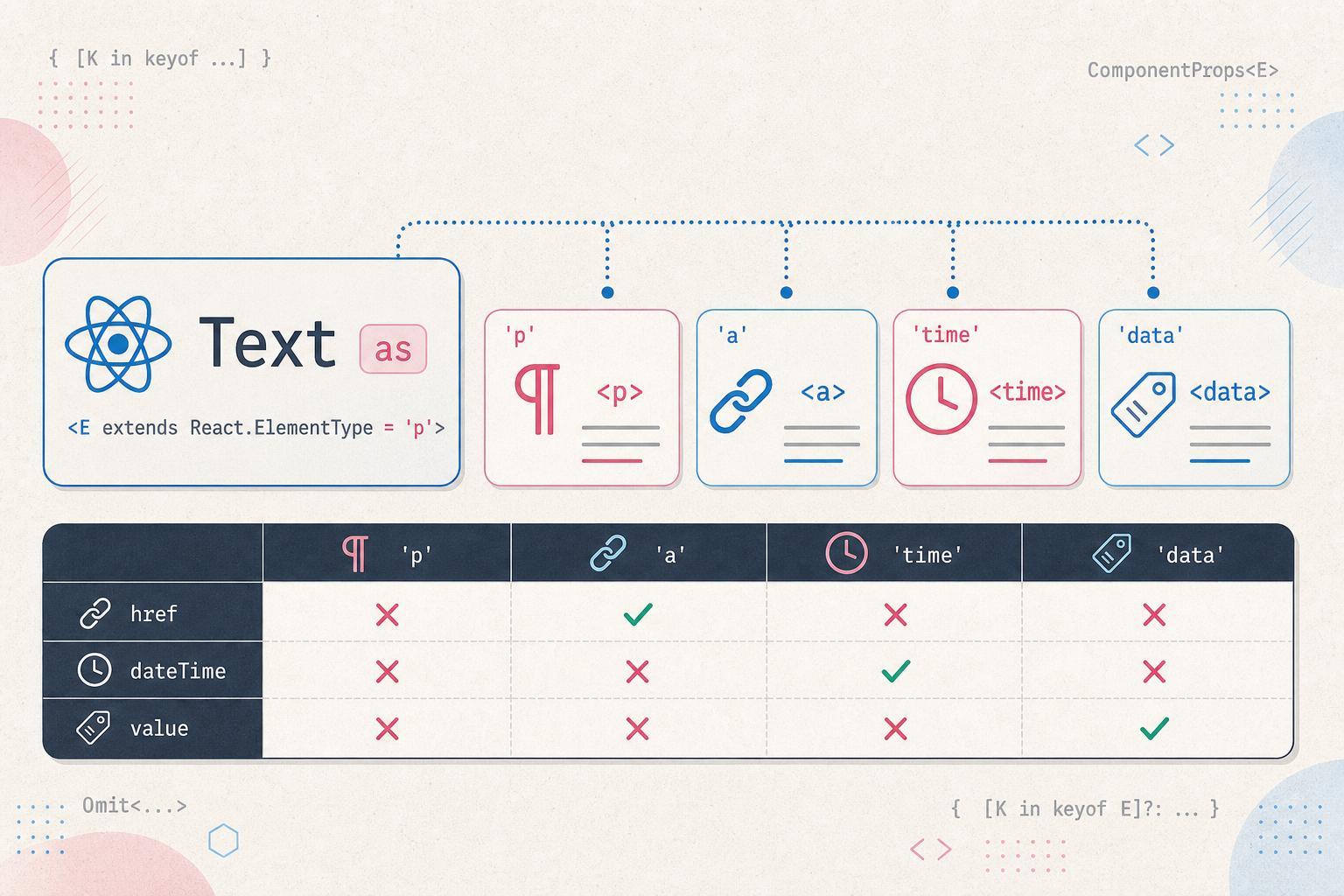
Typed Polymorphic React Component
Kitty Giraudel shares a compact solution for building TypeScript-safe polymorphic components in React, discovered while working on the design system at Duna. The goal is a Text component that accepts an as prop to render as any HTML element — span, a, time, data — while restricting props to only those valid for the chosen element. A naive intersection of {as: E} and React.ComponentProps<E> fails because TypeScript does not narrow the intersection when E is inferred. The working fix is to map over the keys of ComponentProps<E> explicitly, which forces TypeScript to materialize the concrete object type after E has been resolved. Alternatively, wrapping ComponentProps<E> in an Omit (even omitting a nonexistent key) achieves the same effect. The author acknowledges not fully understanding why the mapped type approach works, citing a parallel observation on StackOverflow.
TAG: ACCESSIBILITYREAD_TIME: 10_MIN
Designing for People Who Are D/deaf
TetraLogical's Ela Gorla examines the specific design needs of D/deaf people — distinguishing Deaf (cultural and sign-language community) from deaf (acquired hearing loss) — and goes well beyond simply providing captions. Key recommendations include ensuring media alternatives (captions, transcripts, sign language interpretations) are accurate, synchronized, and placed near the content they accompany rather than buried in nested menus. Forms should prefer predefined options like radio buttons or select elements to reduce spelling errors for people whose first language is sign language. Plain language principles — short sentences, no idioms, expanded acronyms — improve comprehension for this audience. Audio notifications in games, XR, and apps should have visual or haptic equivalents, ideally enabled by default as Fortnite demonstrated in 2024. Inclusive personas and direct involvement of D/deaf people in the design process are recommended to ensure genuine coverage of their needs.
summarizeDigest_Summary
This week's design systems coverage centered on the intersection of AI tooling, token architecture, and governance maturity. Evil Martians built a complete design system for Currents in seven weeks by running an AI audit of 791 files, uncovering 236 unique colors with 1,413 usages, two competing font systems, and parallel icon libraries. The result collapses colors into four OKLCH-defined semantic token groups — elevation, content, UI, and border — chosen specifically because AI agents can extend OKLCH palettes predictably without color drift. Icons migrated via an AI-generated lookup table with 90% accuracy using the Figura One set wrapped with SVGR, and the entire system lives in Figma, Storybook, and GitHub, designed to be consumed by LLMs without a designer in the loop.
Governance and process received equal weight. A detailed workflow guide identified six pillars for healthy design system operations — Contribution, Review and Approval, Documentation, Communication, Iteration, and Versioning and Deprecation — with component timelines ranging from 1-2 weeks for simple changes to 8-12 weeks for complex work. A companion governance article cited that 79% of mature design systems have formal governance, delivering up to 60% better ROI by preventing design drift, and recommended RACI matrices and monthly reviews tracking component reuse versus custom variant rates as early warning metrics.
On the component testing front, Fotis Adamakis delivered a comprehensive Storybook mocking guide covering props, MSW for API interception, redux-mock-store decorators for Redux, the .mock.js pattern for Zustand and custom hooks, and Object.defineProperty stubs for browser APIs like window.matchMedia and IntersectionObserver. Accessibility for D/deaf users was covered by TetraLogical, emphasizing accurate synchronized captions near content, predefined form controls to reduce spelling errors, and default-on visual or haptic equivalents for audio notifications. Kitty Giraudel shared a compact TypeScript pattern for typed polymorphic components discovered while working on the Duna design system, leveraging mapped types to force TypeScript to materialize concrete props after the as prop is resolved.
Key Takeaways- Evil Martians' AI-assisted audit of 791 files cut a 7-week design system build for Currents — using OKLCH tokens specifically because AI agents extend OKLCH palettes predictably without drift.
- Formal governance (RACI matrices, 10-step component request process, semantic versioning, monthly drift reviews) correlates with up to 60% better ROI in mature design systems.
- Storybook's .mock.js file pattern plus MSW covers the full mocking surface for design system components: custom hooks, API calls, Redux, Zustand, and browser APIs in a single consistent approach.