The week's design system coverage was dominated by the intersection of AI tooling and component governance. Evil Martians released Storybook Workbench, a set of… Compiled for immediate developer deployment.
calendar_todaysummarizeWeek 28-2026
article
TAG: MATURITYREAD_TIME: 11_MIN
Design-System Maturity: A 6-Dimension Framework
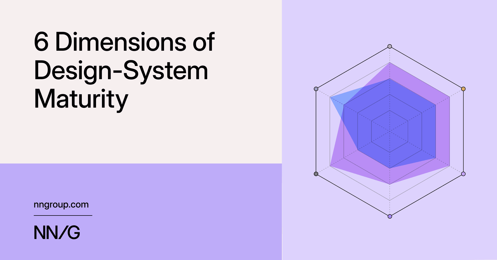
Nielsen Norman Group proposes replacing linear design-system maturity models with a six-dimension assessment covering organizational alignment, team effectiveness, infrastructure robustness, governance, support, and adoption. Linear models fail to capture regression, context-specific maturity, and the reality that adoption is never truly complete. Each dimension is scored 1-5 and plotted on a hexagonal radar chart to produce a profile shape. The shape's area, symmetry, valleys, and spikes each carry distinct diagnostic meaning — a valley in governance can undermine strong infrastructure, while a spike in support is unsustainable without adequate team effectiveness. The framework recommends quarterly reassessment and treats the alignment conversation among evaluators as often more valuable than the scores themselves.
Why Partnering EN 17161 with WCAG Is a Major Step Forward for Digital Accessibility
WCAG's single-page, point-in-time conformance model is fundamentally ill-suited for large, dynamic sites with third-party content and inevitable bugs. Deque argues that EN 17161 Design for All — a management standard pairing with ISO 9001 — fills this gap through issue registries, root cause analysis (RCA), corrective and preventive action (CAPA) tracking, and measurable accessibility goals such as resolving blocking issues within two weeks. WCAG 3.0 is at minimum four years away and will still be an output standard, making EN 17161 the most practical bridge today. EN 17161 is also being integrated into the European Accessibility Act's process requirements, meaning organizations operating in Europe may already need it for EAA compliance. The author recommends starting with leadership buy-in and leveraging existing ISO 9001 or ISO 27001 programs as an entry point.
Storybook Workbench: Audit Vibe-Coded UIs and Find Hidden Bugs in Hours
Evil Martians built Storybook Workbench — a set of Claude Code agent skills prefixed with /sb. — to audit AI-generated codebases that accumulate dead components, conflicting design systems, and hidden component states. On one vibe-coded app with 469 component files, the audit revealed 31 dead components (19 of which were abandoned full page flows) and six accessibility bugs invisible in the running app, including a badge variant with a contrast ratio of 3.87 below WCAG AA and a select with broken combobox roles. Skills fall into four roles: onboard, orchestrate, navigate, and report. Each skill outputs structured JSON, which can be fed to Linear's MCP to generate tickets or exported as a PDF. The sb-figma skill handles bidirectional token sync and Code Connect mappings between Figma and code. The sb-audit skill runs continuously, flagging naming drift and raw hex values creeping back into the codebase.
Storybook 10.3 ships @storybook/addon-mcp, exposing your component library as a structured MCP server at http://localhost:6006/mcp. The server provides six tools across three toolsets: a docs toolset (list-all-documentation, get-documentation, get-documentation-for-story) for component discovery and prop lookup, a dev toolset (get-storybook-story-instructions, preview-stories) for story authoring, and a testing toolset (run-story-tests) that runs Vitest-powered tests and returns structured accessibility violation reports. Without MCP, Claude Code generated a 263-line LoginForm with invented inline input and button elements ignoring the existing design system. With MCP, the same prompt produced 188 lines that correctly imported Button and TextInput, matched exact prop contracts, and autonomously fixed a missing htmlFor/id linkage plus aria-invalid and aria-describedby attributes — an accessibility fix that propagated to every other story using TextInput. The docs toolset relies on component manifests and is currently React-only.
How to Build Production-Ready Card Components with shadcn/ui
This tutorial walks through four production-ready card components built with shadcn/ui and the Shadcn Space third-party registry: a Preview Card (group hover image animation with scale-125 and overflow-hidden clipping), an Analytics Card (TypeScript-typed props with default datasets and conditional cn() badge colors), a Statistics Card (responsive four-column flex grid using@iconify/react Solar icons and last:border-e-0 for automatic trailing-border removal), and an Ecommerce Product Variant Card (named hover groups group/card and group/btn, a CSS-only ripple via scale-[20] on a rounded-full element, useState-driven size selector and wishlist toggle, and suppressHydrationWarning for ordinal delivery-date formatting). Shadcn Space components are installed via a single npx shadcn@latest add @shadcn-space/card-XX command after registering the registry URL in components.json. CSS logical properties like border-e and ps- are used throughout for RTL-safe layouts.
Start with a Design System for Better Coding Agent Results
Coding agents produce inconsistent UIs when they lack a design system to assemble from — buttons that are almost right, spacing that is close but wrong, loading states that feel like a different app. The author recommends establishing a design system first: theme tokens for color, spacing, radius, and typography, plus primitive components like Button, TextInput, and Card with defined variants and states. Agents can bootstrap this foundation themselves (creating theme files, Storybook stories, and example usage), but careful human review of spacing, line heights, and border radii is still necessary. Once in place, prompts become specific: instruct the agent to use existing components in src/components/ui and not to create new primitives unless truly missing. Pairing this with a Figma MCP server lets agents pull layout and sizing context directly, and keeping implementation requests to one screen or flow at a time keeps the feedback loop tight.
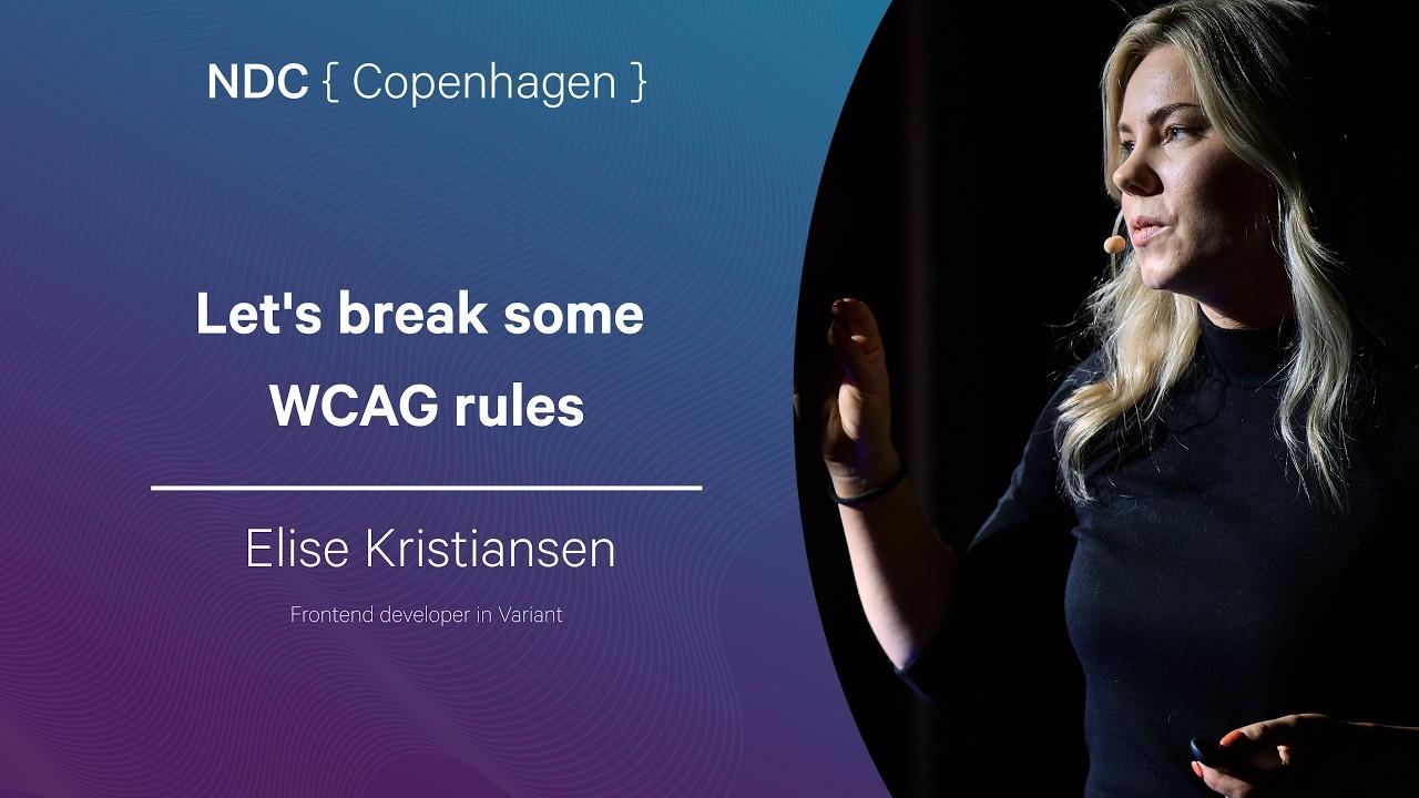
NDC Copenhagen talk by Elise Kristiansen covering practical WCAG issues that developers consistently get wrong. Starting from the story of Mats Steen (Ibelin), a Norwegian gamer with Duchenne muscular dystrophy who built a full social life in World of Warcraft, the talk frames accessibility as a developer responsibility. Core violations demonstrated include: missing alt text and icon labels, improper semantic HTML (divs for headings and links), heading hierarchy misuse, color-only information (illustrated with colorblindness examples), keyboard navigation failures from absolute positioning and flex-direction: row-reverse, missing visible focus indicators, time limits without pause/stop controls, flashing content below the three-flash threshold, and unlabeled or disconnected form labels. Practical recommendations include using a scanner like axe or Pa11y in CI, learning to navigate your own product with a screen reader, and keeping designs simple enough to be accessible by default.
Nielsen Norman Group proposes replacing linear design-system maturity models with a six-dimension assessment covering organizational alignment, team effectiveness, infrastructure robustness, governance, support, and adoption. Linear models fail to capture regression, context-specific maturity, and the reality that adoption is never truly complete. Each dimension is scored 1-5 and plotted on a hexagonal radar chart to produce a profile shape. The shape's area, symmetry, valleys, and spikes each carry distinct diagnostic meaning — a valley in governance can undermine strong infrastructure, while a spike in support is unsustainable without adequate team effectiveness. The framework recommends quarterly reassessment and treats the alignment conversation among evaluators as often more valuable than the scores themselves.
NDC Copenhagen talk by Elise Kristiansen covering practical WCAG issues that developers consistently get wrong. Starting from the story of Mats Steen (Ibelin), a Norwegian gamer with Duchenne muscular dystrophy who built a full social life in World of Warcraft, the talk frames accessibility as a developer responsibility. Core violations demonstrated include: missing alt text and icon labels, improper semantic HTML (divs for headings and links), heading hierarchy misuse, color-only information (illustrated with colorblindness examples), keyboard navigation failures from absolute positioning and flex-direction: row-reverse, missing visible focus indicators, time limits without pause/stop controls, flashing content below the three-flash threshold, and unlabeled or disconnected form labels. Practical recommendations include using a scanner like axe or Pa11y in CI, learning to navigate your own product with a screen reader, and keeping designs simple enough to be accessible by default.
Why Partnering EN 17161 with WCAG Is a Major Step Forward for Digital Accessibility
WCAG's single-page, point-in-time conformance model is fundamentally ill-suited for large, dynamic sites with third-party content and inevitable bugs. Deque argues that EN 17161 Design for All — a management standard pairing with ISO 9001 — fills this gap through issue registries, root cause analysis (RCA), corrective and preventive action (CAPA) tracking, and measurable accessibility goals such as resolving blocking issues within two weeks. WCAG 3.0 is at minimum four years away and will still be an output standard, making EN 17161 the most practical bridge today. EN 17161 is also being integrated into the European Accessibility Act's process requirements, meaning organizations operating in Europe may already need it for EAA compliance. The author recommends starting with leadership buy-in and leveraging existing ISO 9001 or ISO 27001 programs as an entry point.
Storybook Workbench: Audit Vibe-Coded UIs and Find Hidden Bugs in Hours
Evil Martians built Storybook Workbench — a set of Claude Code agent skills prefixed with /sb. — to audit AI-generated codebases that accumulate dead components, conflicting design systems, and hidden component states. On one vibe-coded app with 469 component files, the audit revealed 31 dead components (19 of which were abandoned full page flows) and six accessibility bugs invisible in the running app, including a badge variant with a contrast ratio of 3.87 below WCAG AA and a select with broken combobox roles. Skills fall into four roles: onboard, orchestrate, navigate, and report. Each skill outputs structured JSON, which can be fed to Linear's MCP to generate tickets or exported as a PDF. The sb-figma skill handles bidirectional token sync and Code Connect mappings between Figma and code. The sb-audit skill runs continuously, flagging naming drift and raw hex values creeping back into the codebase.
Storybook 10.3 ships @storybook/addon-mcp, exposing your component library as a structured MCP server at http://localhost:6006/mcp. The server provides six tools across three toolsets: a docs toolset (list-all-documentation, get-documentation, get-documentation-for-story) for component discovery and prop lookup, a dev toolset (get-storybook-story-instructions, preview-stories) for story authoring, and a testing toolset (run-story-tests) that runs Vitest-powered tests and returns structured accessibility violation reports. Without MCP, Claude Code generated a 263-line LoginForm with invented inline input and button elements ignoring the existing design system. With MCP, the same prompt produced 188 lines that correctly imported Button and TextInput, matched exact prop contracts, and autonomously fixed a missing htmlFor/id linkage plus aria-invalid and aria-describedby attributes — an accessibility fix that propagated to every other story using TextInput. The docs toolset relies on component manifests and is currently React-only.
How to Build Production-Ready Card Components with shadcn/ui
This tutorial walks through four production-ready card components built with shadcn/ui and the Shadcn Space third-party registry: a Preview Card (group hover image animation with scale-125 and overflow-hidden clipping), an Analytics Card (TypeScript-typed props with default datasets and conditional cn() badge colors), a Statistics Card (responsive four-column flex grid using@iconify/react Solar icons and last:border-e-0 for automatic trailing-border removal), and an Ecommerce Product Variant Card (named hover groups group/card and group/btn, a CSS-only ripple via scale-[20] on a rounded-full element, useState-driven size selector and wishlist toggle, and suppressHydrationWarning for ordinal delivery-date formatting). Shadcn Space components are installed via a single npx shadcn@latest add @shadcn-space/card-XX command after registering the registry URL in components.json. CSS logical properties like border-e and ps- are used throughout for RTL-safe layouts.
Start with a Design System for Better Coding Agent Results
Coding agents produce inconsistent UIs when they lack a design system to assemble from — buttons that are almost right, spacing that is close but wrong, loading states that feel like a different app. The author recommends establishing a design system first: theme tokens for color, spacing, radius, and typography, plus primitive components like Button, TextInput, and Card with defined variants and states. Agents can bootstrap this foundation themselves (creating theme files, Storybook stories, and example usage), but careful human review of spacing, line heights, and border radii is still necessary. Once in place, prompts become specific: instruct the agent to use existing components in src/components/ui and not to create new primitives unless truly missing. Pairing this with a Figma MCP server lets agents pull layout and sizing context directly, and keeping implementation requests to one screen or flow at a time keeps the feedback loop tight.
The week's design system coverage was dominated by the intersection of AI tooling and component governance. Evil Martians released Storybook Workbench, a set of Claude Code agent skills prefixed with /sb., built to audit vibe-coded codebases. On a real 469-component app it found 31 dead components — 19 of them abandoned full page flows — and six accessibility bugs invisible in the running app, including a badge variant with a contrast ratio of 3.87 (below WCAG AA's 4.5) and a select with broken combobox roles. The four skills (onboard, orchestrate, navigate, report) output structured JSON that can feed Linear's MCP for ticket creation or be exported as PDF. Storybook 10.3's new @storybook/addon-mcp exposes component libraries as a structured MCP server at http://localhost:6006/mcp across three toolsets — docs, dev, and testing — enabling Claude Code to produce correct component usage rather than inventing inline primitives.
Nielsen Norman Group proposed replacing linear design-system maturity models with a six-dimension framework covering organizational alignment, team effectiveness, infrastructure robustness, governance, support, and adoption, plotted on a hexagonal radar chart scored 1–5. The model treats the evaluator discussion as often more valuable than the scores. A practical counterpart recommended that teams establish design system foundations before deploying coding agents: theme tokens, primitive components with defined variants, and a Figma MCP server for layout context, limiting agent prompts to one screen at a time.
Accessibility standards also featured prominently: Deque argued that EN 17161 Design for All — an ISO 9001-style management standard with issue registries, RCA, and CAPA tracking — is a more practical complement to WCAG than waiting for WCAG 3.0, which is at least four years away and will still be an output-only standard. An NDC Copenhagen talk demonstrated common WCAG violations including flex-direction: row-reverse keyboard navigation failures and missing aria-invalid linkages.
Key Takeaways
Storybook Workbench (Claude Code /sb. skills) found 31 dead components and 6 invisible accessibility bugs — including a 3.87 contrast-ratio badge — in a 469-component vibe-coded app; outputs feed Linear MCP for automated ticket creation.
Storybook 10.3's @storybook/addon-mcp exposes your library at localhost:6006/mcp — in testing, Claude Code reduced a generated component from 263 lines with invented primitives to 188 lines with correct Button and TextInput imports plus autonomous accessibility fixes.
EN 17161 Design for All pairs with ISO 9001 to provide process-level accessibility governance (issue registries, RCA, CAPA) that WCAG's point-in-time conformance model cannot — increasingly relevant as European Accessibility Act deadlines approach.