This week's CSS coverage centered on new platform capabilities that reduce JavaScript dependency. The CSS Anchor Positioning API — using anchor-name,… Compiled for immediate developer deployment.
calendar_todaysummarizeWeek 28-2026
article
TAG: LAYOUTREAD_TIME: 9_MIN
Getting Started with Anchor Positioning
The CSS Anchor Positioning API lets you attach floating elements like tooltips and dropdowns to any anchor element using anchor-name and position-anchor properties, replacing JavaScript-based positioning logic. The position-area property places the target in a conceptual 3x3 grid around the anchor, and position-try-fallbacks automatically flips the tooltip to the opposite side when viewport space runs out. The Level 2 spec introduces anchored container queries (container-type: anchored), currently Chromium-only as of July 2026, enabling CSS-driven caret direction changes based on which fallback position is active. The flip-block keyword provides a cross-browser shortcut for vertical flipping and even mirrors directional margins automatically. Fallback strategies include the Oddbird polyfill and @supports feature queries for graceful degradation.
This article demystifies cubic-bezier() easing by connecting it to the Bezier handle mechanics designers already use in vector tools like Figma. The four numbers in cubic-bezier(x1, y1, x2, y2) represent two control handles: x values control time (clamped 0-1), while y values control progress and can exceed that range to produce overshoot or windup effects. The article maps all five CSS keyword presets to their exact cubic-bezier equivalents — ease-out is cubic-bezier(0, 0, 0.58, 1) — and defines a clear rule: use ease-out for entrances, ease-in for exits, ease-in-out for moves between visible positions. For physics-based bounces that a single Bezier arc cannot model, CSS linear() can encode a real spring equation. A @media (prefers-reduced-motion: reduce) snippet is presented as the mandatory first line of any motion system.
Written by a former print designer, this article catalogs six CSS controls that bring editorial typography to the web with no JavaScript. Fluid type scales are built using clamp() with a rem + vw preferred value to scale with the viewport while respecting user font preferences. text-wrap: balance prevents ragged headlines (capped at six lines in Chromium), while text-wrap: pretty fixes widows in body copy by reworking only the last few lines. initial-letter provides native drop caps (unsupported in Firefox, degrades gracefully), font-optical-sizing: auto drives the opsz variable font axis from rendered size, and hanging-punctuation: first pushes opening quotes into the margin for optical alignment (currently Safari-only). A browser support table covers Chrome, Firefox, and Safari for all six properties.
How to Build a Dark Mode Toggle Without JavaScript
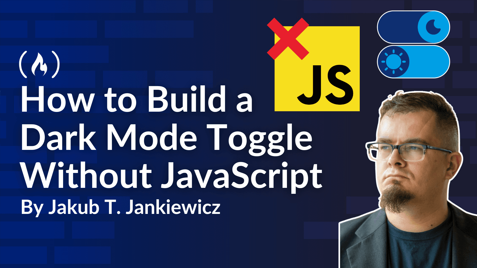
This article by Jakub T Jankiewicz demonstrates a JavaScript-free dark mode toggle using HTML radio inputs paired with the CSS :has() pseudo-class. The selector :root:has(#mode_dark:checked) acts as a parent-aware condition that triggers CSS custom property overrides for --bg and --fg across the entire page. Radio inputs are visually hidden using appearance: none, opacity: 0, and pointer-events: none, with labels containing sun and moon emoji acting as the clickable UI. The @media (prefers-color-scheme: dark) query sets the default state to match the system preference, and manual radio selection overrides it persistently. The approach benefits static sites, SSG tools like Eleventy, and scenarios where JavaScript is unavailable to AI crawlers or low-bandwidth users.
Remy Sharp observes that CSS currently lacks wildcard element selectors, making it impossible to write rules like rem-* { } to target all custom elements sharing a prefix. Existing workarounds rely on attribute selectors such as [class^="btn-"] (starts-with, brittle) or [class*="btn"] (contains, overly broad), neither of which works for element tag names. The same gap affects querySelectorAll, requiring a full DOM scan to initialize custom elements by prefix rather than a targeted selector. Sharp notes Lea Verou filed this issue with the CSSWG over two years ago with little traction, and explores whether the * character is legally available in CSS grammar for this purpose since the parser currently only permits * after whitespace or within attribute selectors following =.
Building a Scroll-Driven 3D Gallery Using a Blender Camera Path with Three.js and GSAP
This Codrops tutorial by Gaspard Hedde walks through building a scroll-driven 3D gallery where a camera follows a Bezier curve drawn in Blender, exported as JSON via a Python script that remaps Blender's Z-up coordinate system to Three.js's Y-up system. The curve is reconstructed in Three.js using CatmullRomCurve3 and 500 image planes are distributed along it with randomized lateral and depth offsets derived from the curve's local normal vector. GSAP's quickTo drives both camera smoothing (power3.out over one second) and per-plane scale animations, avoiding the creation of 500 new tweens per frame. A proximity-based focus system scales images up to 14x when they approach the camera, using a cubic falloff (f cubed) to keep the effect localized. Path switching redistributes all planes with individual gsap.to() calls for smooth layout transitions.
This Coding2GO video explains @starting-style, the CSS rule that provides a first-frame starting point for transitions on elements that have no prior CSS state — such as dialog elements or conditionally rendered React components. Without @starting-style, a dialog already matches its open attribute selector on entry, so the browser has no before-state to transition from. The fix is to declare opacity: 0 and scale: 0.8 inside @starting-style, telling the browser to treat those as the element's initial values. For dialog, discrete properties like display and overlay must also be added to the transition list with allow-discrete so the element stays rendered long enough for the fade-out to complete. The video extends the pattern to the ::backdrop pseudo-element and to React-rendered lists, and closes with a reminder to wrap all motion in @media (prefers-reduced-motion: reduce).
The CSS Anchor Positioning API lets you attach floating elements like tooltips and dropdowns to any anchor element using anchor-name and position-anchor properties, replacing JavaScript-based positioning logic. The position-area property places the target in a conceptual 3x3 grid around the anchor, and position-try-fallbacks automatically flips the tooltip to the opposite side when viewport space runs out. The Level 2 spec introduces anchored container queries (container-type: anchored), currently Chromium-only as of July 2026, enabling CSS-driven caret direction changes based on which fallback position is active. The flip-block keyword provides a cross-browser shortcut for vertical flipping and even mirrors directional margins automatically. Fallback strategies include the Oddbird polyfill and @supports feature queries for graceful degradation.
This Coding2GO video explains @starting-style, the CSS rule that provides a first-frame starting point for transitions on elements that have no prior CSS state — such as dialog elements or conditionally rendered React components. Without @starting-style, a dialog already matches its open attribute selector on entry, so the browser has no before-state to transition from. The fix is to declare opacity: 0 and scale: 0.8 inside @starting-style, telling the browser to treat those as the element's initial values. For dialog, discrete properties like display and overlay must also be added to the transition list with allow-discrete so the element stays rendered long enough for the fade-out to complete. The video extends the pattern to the ::backdrop pseudo-element and to React-rendered lists, and closes with a reminder to wrap all motion in @media (prefers-reduced-motion: reduce).
This article demystifies cubic-bezier() easing by connecting it to the Bezier handle mechanics designers already use in vector tools like Figma. The four numbers in cubic-bezier(x1, y1, x2, y2) represent two control handles: x values control time (clamped 0-1), while y values control progress and can exceed that range to produce overshoot or windup effects. The article maps all five CSS keyword presets to their exact cubic-bezier equivalents — ease-out is cubic-bezier(0, 0, 0.58, 1) — and defines a clear rule: use ease-out for entrances, ease-in for exits, ease-in-out for moves between visible positions. For physics-based bounces that a single Bezier arc cannot model, CSS linear() can encode a real spring equation. A @media (prefers-reduced-motion: reduce) snippet is presented as the mandatory first line of any motion system.
Written by a former print designer, this article catalogs six CSS controls that bring editorial typography to the web with no JavaScript. Fluid type scales are built using clamp() with a rem + vw preferred value to scale with the viewport while respecting user font preferences. text-wrap: balance prevents ragged headlines (capped at six lines in Chromium), while text-wrap: pretty fixes widows in body copy by reworking only the last few lines. initial-letter provides native drop caps (unsupported in Firefox, degrades gracefully), font-optical-sizing: auto drives the opsz variable font axis from rendered size, and hanging-punctuation: first pushes opening quotes into the margin for optical alignment (currently Safari-only). A browser support table covers Chrome, Firefox, and Safari for all six properties.
How to Build a Dark Mode Toggle Without JavaScript
This article by Jakub T Jankiewicz demonstrates a JavaScript-free dark mode toggle using HTML radio inputs paired with the CSS :has() pseudo-class. The selector :root:has(#mode_dark:checked) acts as a parent-aware condition that triggers CSS custom property overrides for --bg and --fg across the entire page. Radio inputs are visually hidden using appearance: none, opacity: 0, and pointer-events: none, with labels containing sun and moon emoji acting as the clickable UI. The @media (prefers-color-scheme: dark) query sets the default state to match the system preference, and manual radio selection overrides it persistently. The approach benefits static sites, SSG tools like Eleventy, and scenarios where JavaScript is unavailable to AI crawlers or low-bandwidth users.
Remy Sharp observes that CSS currently lacks wildcard element selectors, making it impossible to write rules like rem-* { } to target all custom elements sharing a prefix. Existing workarounds rely on attribute selectors such as [class^="btn-"] (starts-with, brittle) or [class*="btn"] (contains, overly broad), neither of which works for element tag names. The same gap affects querySelectorAll, requiring a full DOM scan to initialize custom elements by prefix rather than a targeted selector. Sharp notes Lea Verou filed this issue with the CSSWG over two years ago with little traction, and explores whether the * character is legally available in CSS grammar for this purpose since the parser currently only permits * after whitespace or within attribute selectors following =.
Building a Scroll-Driven 3D Gallery Using a Blender Camera Path with Three.js and GSAP
This Codrops tutorial by Gaspard Hedde walks through building a scroll-driven 3D gallery where a camera follows a Bezier curve drawn in Blender, exported as JSON via a Python script that remaps Blender's Z-up coordinate system to Three.js's Y-up system. The curve is reconstructed in Three.js using CatmullRomCurve3 and 500 image planes are distributed along it with randomized lateral and depth offsets derived from the curve's local normal vector. GSAP's quickTo drives both camera smoothing (power3.out over one second) and per-plane scale animations, avoiding the creation of 500 new tweens per frame. A proximity-based focus system scales images up to 14x when they approach the camera, using a cubic falloff (f cubed) to keep the effect localized. Path switching redistributes all planes with individual gsap.to() calls for smooth layout transitions.
This week's CSS coverage centered on new platform capabilities that reduce JavaScript dependency. The CSS Anchor Positioning API — using anchor-name, position-anchor, and position-area — lets tooltips and dropdowns snap to any anchor element, with position-try-fallbacks handling automatic viewport-edge flipping. The forthcoming Level 2 spec adds container-type: anchored for CSS-driven caret direction, currently Chromium-only. Alongside this, @starting-style solves a long-standing gap: elements like dialog and conditionally rendered React components previously had no before-state for CSS transitions to animate from. Declaring initial values inside @starting-style, combined with allow-discrete on the transition list for discrete properties like display and overlay, enables smooth enter and exit animations without JavaScript.
Typography received focused attention through a roundup of six CSS editorial controls — clamp()-based fluid type scales, text-wrap: balance and text-wrap: pretty for headline and body wrapping, initial-letter for drop caps, font-optical-sizing: auto for variable font opsz axis control, and hanging-punctuation: first for optical margin alignment (currently Safari-only). A complementary guide demystified cubic-bezier() easing by mapping all five CSS keyword presets to their exact values and establishing a rule: ease-out for entrances, ease-in for exits, ease-in-out for moves. For physics-based bounces that a single Bezier arc cannot model, CSS linear() can encode a real spring equation.
A JavaScript-free dark mode toggle using radio inputs and the :has() pseudo-class demonstrated :root:has(#mode_dark:checked) as a parent-aware custom property trigger, useful for static sites and AI crawlers. Remy Sharp opened a discussion on the missing wildcard element selector in CSS — the inability to write rules targeting rem-* elements — noting Lea Verou filed the issue with the CSSWG over two years ago with little progress.
Key Takeaways
CSS Anchor Positioning (anchor-name, position-area, position-try-fallbacks) is now the standard approach for floating UI positioning; the Level 2 container-type: anchored feature is Chromium-only as of July 2026.
@starting-style unlocks CSS-native enter/exit transitions on dialog and conditionally rendered elements — pair it with allow-discrete on the transition property to prevent abrupt display: none cutoffs.
Six editorial CSS properties — clamp() fluid scaling, text-wrap: balance/pretty, initial-letter, font-optical-sizing: auto, and hanging-punctuation: first — bring print-quality typography to the web with no JavaScript.