CSS architecture, utility frameworks, and animation performance Compiled for immediate developer deployment.
calendar_todaysummarizeWeek 29-2026bolt1 CRITICAL
article
Throwing Confetti with CSS Random
TAG: CSS FEATURE
Schalk Neethling builds a 50-piece, zero-JavaScript confetti field using the still-experimental random() function, available in Safari 26.2+ and Chrome 148+ (behind enable-experimental-web-platform-features); Firefox has no support as of July 13, 2026. The key mental model is the random cache name — a tuple of an optional <dashed-ident>, the element, and the document — which makes values a deterministic lookup rather than a per-paint roll, explaining why the confetti reshuffles on reload but holds position through style recalculations. An unregistered custom property stores the random() text and evaluates it at each var() substitution site, so a property read twice yields two different numbers unless an explicit name is given. The portable fallback pattern wraps defaults and :nth-child rules inside @layer fallback so the unlayered @supports block always wins on layer priority — avoiding the specificity trap that lets :nth-child(8n+1) silently override the enhancement. Safari discards random() inside @property-registered custom properties, a divergence from Chromium that the author documents live.
What's !important #15: Boundary-aware CSS, Time-based CSS, Full-bleed CSS, and More | CSS-Tricks
TAG: ECOSYSTEM
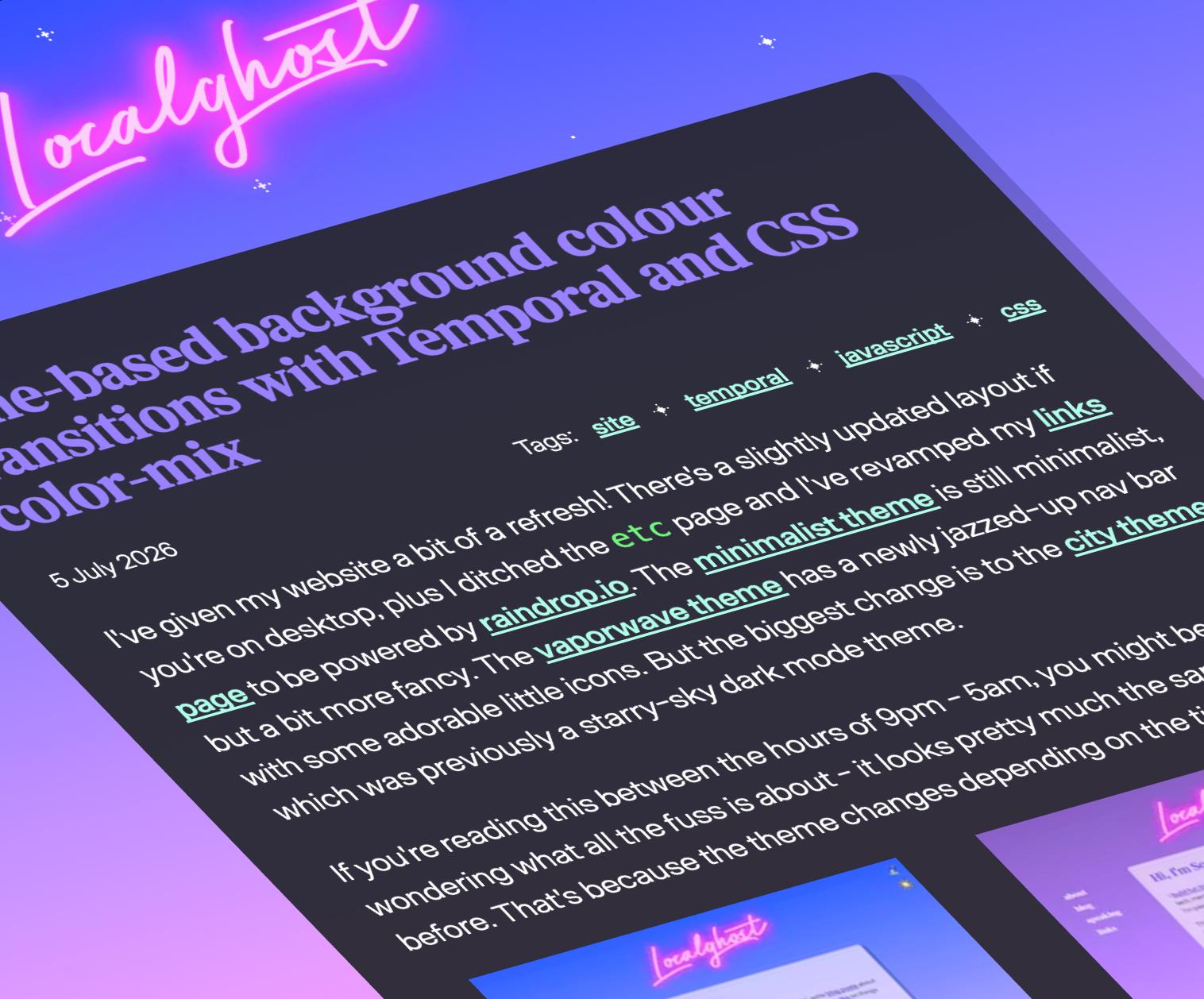
CSS-Tricks issue #15 curates a dense two-week sweep: Preethi Sam's view()-based boundary-aware CSS generates scroll-range effects without JavaScript; Sophie Koonin's time-based designs combine the Temporal API with color-mix() for macOS-style dynamic themes; and David Bushell's full-bleed fix uses container-query units to break out of nested wrappers without overflow. Chrome 150 ships a batch of features still absent from Safari and Firefox: flex-wrap: balance, text-fit, named-feature(), focusgroup, and animatable zoom. AccentColor and AccentColorText reached Baseline in Chrome 150; background-clip: border-area and corner rounding for polygon() landed in Chrome but lack Firefox support. Manuel Matuzović flagged that grid-lanes layout (formerly masonry) is not yet accessible; a reading-flow fix has been proposed but not yet tested at scale.
Ahmad Shadeed dismantles the FIFA World Cup tournament bracket UI — where the official markup artificially splits each round into separate sibling elements — and rebuilds it with semantically nested HTML using CSS subgrid on both grid-template-columns and grid-template-rows. Each .round spans the full parent grid with grid-column: 1 / -1 and grid-row: 1 / -1, then re-exposes the same tracks via display: grid; grid-template-columns: subgrid; grid-template-rows: subgrid, letting its .start and .end children place themselves at grid-column: 1 and grid-column: -2 respectively. Vertical centering of match pairs requires display: flex; flex-direction: column on each half-column and flex: 1 on each match container, distributing space equally so connector lines remain mid-aligned across rounds. Responsive behavior collapses rounds to a single column without splitting, using grid-template-columns: repeat(4, 1fr) at narrower widths. The article focuses solely on layout, explicitly omitting animations and hover effects.
The Architecture Behind Trionn: Coordinating GSAP, Three.js, Lenis, and Web Audio | Codrops
TAG: CREATIVE CODING
This Codrops case study from the Trionn studio team exposes the four-month architecture of an award-winning portfolio site (FWA, GSAP, CSS Design Awards) that treats animation, WebGL, and audio as a single unified system. GSAP + @gsap/react drives page transitions and scroll-driven sequences via ScrollTrigger; a single normalized scrollProgressRef (0–1) orchestrates 371 WebP frames, glyph-particle explosions, service-card curved-path animations, and a color-palette flip — all without multiple conflicting timelines. Three.js is used raw (not React Three Fiber) for direct control over the shared render loop; hover detection uses raycasting against the symbol's actual 3D geometry, and rounded card corners are generated by a signed-distance-function fragment shader rather than transparent PNGs. The 371 WebP frames are preloaded in requestIdleCallback batches of 20 with img.decode(), and the gallery WebGL scene is explicitly warmed up — shaders compiled, textures uploaded — before the section enters view. Every sound effect, including the footer's pluckable guitar-string wordmark and hero hover beep, is synthesized at runtime with the Web Audio API using oscillators, vibrato LFOs, and feedback delays rather than prerecorded files.
Under my radar: the highlight API, text-indent and font-family: math | utilitybend
TAG: CSS FEATURE
Brecht De Ruyte spotlights three quietly-Baseline CSS features often overshadowed by flashier additions. The CSS Custom Highlight API — available since Chrome 105, Safari 17.2, and Firefox 111 — replaces the old DOM-splitting approach with CSS.highlights.set() and the ::highlight() pseudo-element; the browser intercepts the paint phase and draws colored rectangles directly under glyphs, skipping layout entirely and eliminating reflows. The text-indent keywords hanging and each-line reached full Baseline in March 2026 with Chrome 146 (Safari and Firefox shipped earlier): hanging produces bibliography-style indents natively, and each-line applies indentation after every <br> break — previously impossible without padding hacks. font-family: math with native MathML tags (<math>, <mfrac>, <msub>) instructs the browser to load math-layout fonts like STIX or Latin Modern Math, enabling accessible screen-reader output for equations without external JavaScript libraries; both features became Baseline in 2023 with Chrome 109.
The most fun I've had with CSS in a while thanks to offset-path
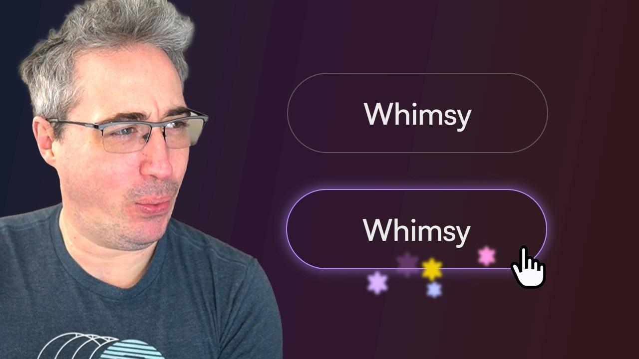
Kevin Powell builds whimsical button sparkle decorations using offset-path: border-box — a technique he discovered from Eric Meyer's CSS Day talk — demonstrating that no SVG path is needed to animate elements along an element's own border. Setting offset-path: border-box on an absolutely-positioned <span> places it on the border, and animating offset-distance (e.g., to 80%) drives it around the border radius in full; offset-rotate: 0deg keeps the decoration upright while traveling. Star-shaped decorations are built by layering pseudo-elements with rotate, blurred with filter: blur(2px), and given a lifecycle via a @keyframes opacity ramp (0% → 20%–80% opaque → 100% transparent). Custom properties (--deco-timing, --deco-color, --end-offset, --speed-variation) centralize control so each of five-plus decorations can differ in scale, color (via oklch() relative color), travel distance, and speed without hunting through individual rules. Animations and transitions must be scoped to :hover / :focus-visible so offset-distance always resets to start on each interaction.
Intro to Shaders – JavaScript & p5.js Course for Beginners
Instructor Pat Verra (freeCodeCamp) walks through a four-episode beginner GLSL series using p5.js v2 in WebGL mode, culminating in an animated fractal heart rendered entirely on the GPU. The core insight is that a fragment shader runs once per pixel per frame — 480,000 times on an 800×600 canvas, over 2 million on 1080p — and each invocation is isolated, knowing only its own gl_FragCoord position and CPU-supplied uniform values like uTime and uResolution. The course teaches fract() for domain repetition (tiling a 4×4 grid without loops), signed-distance functions for shape detection (circle, heart, rounded box from Inigo Quilez's 2D SDF library), the inverse-distance glow formula (0.05 / d modelling light falloff), a cosine-palette color function for rich multi-hue gradients, and accumulation via a for-loop that adds successive UV remappings to create fractal depth. The pixelDensity(1) call is essential on high-DPI screens to keep gl_FragCoord and canvas dimensions in a 1:1 ratio; omitting it produces misaligned geometry.
Schalk Neethling builds a 50-piece, zero-JavaScript confetti field using the still-experimental random() function, available in Safari 26.2+ and Chrome 148+ (behind enable-experimental-web-platform-features); Firefox has no support as of July 13, 2026. The key mental model is the random cache name — a tuple of an optional <dashed-ident>, the element, and the document — which makes values a deterministic lookup rather than a per-paint roll, explaining why the confetti reshuffles on reload but holds position through style recalculations. An unregistered custom property stores the random() text and evaluates it at each var() substitution site, so a property read twice yields two different numbers unless an explicit name is given. The portable fallback pattern wraps defaults and :nth-child rules inside @layer fallback so the unlayered @supports block always wins on layer priority — avoiding the specificity trap that lets :nth-child(8n+1) silently override the enhancement. Safari discards random() inside @property-registered custom properties, a divergence from Chromium that the author documents live.
The most fun I've had with CSS in a while thanks to offset-path
Kevin Powell builds whimsical button sparkle decorations using offset-path: border-box — a technique he discovered from Eric Meyer's CSS Day talk — demonstrating that no SVG path is needed to animate elements along an element's own border. Setting offset-path: border-box on an absolutely-positioned <span> places it on the border, and animating offset-distance (e.g., to 80%) drives it around the border radius in full; offset-rotate: 0deg keeps the decoration upright while traveling. Star-shaped decorations are built by layering pseudo-elements with rotate, blurred with filter: blur(2px), and given a lifecycle via a @keyframes opacity ramp (0% → 20%–80% opaque → 100% transparent). Custom properties (--deco-timing, --deco-color, --end-offset, --speed-variation) centralize control so each of five-plus decorations can differ in scale, color (via oklch() relative color), travel distance, and speed without hunting through individual rules. Animations and transitions must be scoped to :hover / :focus-visible so offset-distance always resets to start on each interaction.
Intro to Shaders – JavaScript & p5.js Course for Beginners
Instructor Pat Verra (freeCodeCamp) walks through a four-episode beginner GLSL series using p5.js v2 in WebGL mode, culminating in an animated fractal heart rendered entirely on the GPU. The core insight is that a fragment shader runs once per pixel per frame — 480,000 times on an 800×600 canvas, over 2 million on 1080p — and each invocation is isolated, knowing only its own gl_FragCoord position and CPU-supplied uniform values like uTime and uResolution. The course teaches fract() for domain repetition (tiling a 4×4 grid without loops), signed-distance functions for shape detection (circle, heart, rounded box from Inigo Quilez's 2D SDF library), the inverse-distance glow formula (0.05 / d modelling light falloff), a cosine-palette color function for rich multi-hue gradients, and accumulation via a for-loop that adds successive UV remappings to create fractal depth. The pixelDensity(1) call is essential on high-DPI screens to keep gl_FragCoord and canvas dimensions in a 1:1 ratio; omitting it produces misaligned geometry.
What's !important #15: Boundary-aware CSS, Time-based CSS, Full-bleed CSS, and More | CSS-Tricks
CSS-Tricks issue #15 curates a dense two-week sweep: Preethi Sam's view()-based boundary-aware CSS generates scroll-range effects without JavaScript; Sophie Koonin's time-based designs combine the Temporal API with color-mix() for macOS-style dynamic themes; and David Bushell's full-bleed fix uses container-query units to break out of nested wrappers without overflow. Chrome 150 ships a batch of features still absent from Safari and Firefox: flex-wrap: balance, text-fit, named-feature(), focusgroup, and animatable zoom. AccentColor and AccentColorText reached Baseline in Chrome 150; background-clip: border-area and corner rounding for polygon() landed in Chrome but lack Firefox support. Manuel Matuzović flagged that grid-lanes layout (formerly masonry) is not yet accessible; a reading-flow fix has been proposed but not yet tested at scale.
Ahmad Shadeed dismantles the FIFA World Cup tournament bracket UI — where the official markup artificially splits each round into separate sibling elements — and rebuilds it with semantically nested HTML using CSS subgrid on both grid-template-columns and grid-template-rows. Each .round spans the full parent grid with grid-column: 1 / -1 and grid-row: 1 / -1, then re-exposes the same tracks via display: grid; grid-template-columns: subgrid; grid-template-rows: subgrid, letting its .start and .end children place themselves at grid-column: 1 and grid-column: -2 respectively. Vertical centering of match pairs requires display: flex; flex-direction: column on each half-column and flex: 1 on each match container, distributing space equally so connector lines remain mid-aligned across rounds. Responsive behavior collapses rounds to a single column without splitting, using grid-template-columns: repeat(4, 1fr) at narrower widths. The article focuses solely on layout, explicitly omitting animations and hover effects.
The Architecture Behind Trionn: Coordinating GSAP, Three.js, Lenis, and Web Audio | Codrops
This Codrops case study from the Trionn studio team exposes the four-month architecture of an award-winning portfolio site (FWA, GSAP, CSS Design Awards) that treats animation, WebGL, and audio as a single unified system. GSAP + @gsap/react drives page transitions and scroll-driven sequences via ScrollTrigger; a single normalized scrollProgressRef (0–1) orchestrates 371 WebP frames, glyph-particle explosions, service-card curved-path animations, and a color-palette flip — all without multiple conflicting timelines. Three.js is used raw (not React Three Fiber) for direct control over the shared render loop; hover detection uses raycasting against the symbol's actual 3D geometry, and rounded card corners are generated by a signed-distance-function fragment shader rather than transparent PNGs. The 371 WebP frames are preloaded in requestIdleCallback batches of 20 with img.decode(), and the gallery WebGL scene is explicitly warmed up — shaders compiled, textures uploaded — before the section enters view. Every sound effect, including the footer's pluckable guitar-string wordmark and hero hover beep, is synthesized at runtime with the Web Audio API using oscillators, vibrato LFOs, and feedback delays rather than prerecorded files.
Under my radar: the highlight API, text-indent and font-family: math | utilitybend
Brecht De Ruyte spotlights three quietly-Baseline CSS features often overshadowed by flashier additions. The CSS Custom Highlight API — available since Chrome 105, Safari 17.2, and Firefox 111 — replaces the old DOM-splitting approach with CSS.highlights.set() and the ::highlight() pseudo-element; the browser intercepts the paint phase and draws colored rectangles directly under glyphs, skipping layout entirely and eliminating reflows. The text-indent keywords hanging and each-line reached full Baseline in March 2026 with Chrome 146 (Safari and Firefox shipped earlier): hanging produces bibliography-style indents natively, and each-line applies indentation after every <br> break — previously impossible without padding hacks. font-family: math with native MathML tags (<math>, <mfrac>, <msub>) instructs the browser to load math-layout fonts like STIX or Latin Modern Math, enabling accessible screen-reader output for equations without external JavaScript libraries; both features became Baseline in 2023 with Chrome 109.
This week's CSS & Styling issue is headlined by the nascent random() function — Schalk Neethling's 28-minute deep-dive is the definitive guide to its random-cache-name model, progressive-enhancement traps, and why @layer beats @supports not for fallback architecture. Safari 26.2 and Chrome 148 (flag) ship it; Firefox has zero support as of July 2026.
Ahmad Shadeed shows how subgrid on both axes solves the FIFA tournament bracket problem — child elements share a parent grid without restructuring the DOM, and align-items: center plus flex: 1 keep match connectors pixel-aligned. Kevin Powell's video makes offset-path: border-box feel like a revelation: no SVG path required, just animate offset-distance for whimsical button sparkle effects.
Brecht De Ruyte surfaces three quietly-Baseline features — the CSS Custom Highlight API (no DOM mutations), text-indent: hanging / each-line (Baseline March 2026), and native font-family: math for accessible MathML. The CSS-Tricks newsletter rounds up Chrome 150 shipping flex-wrap: balance, text-fit, and named-feature(), all still missing from Safari and Firefox.
On the creative-coding front, the Trionn case study reveals an ambitious four-month architecture: GSAP + ScrollTrigger driving 371-frame WebP scrubbing, Three.js raycasting for hover detection on animated geometry, fragment shaders for procedural fog and rounded corners, and Web Audio API synthesizing every sound at runtime. The freeCodeCamp shader course completes the picture, walking beginners from GLSL vertex/fragment fundamentals through domain repetition and fract()-based tiling to a fractal heart built entirely on the GPU.
Key Takeaways
CSS random() is shipping in Safari 26.2 and Chrome 148 (flag) but not Firefox; its random-cache-name model means values are a deterministic lookup keyed by element, property, and document — not a per-paint dice roll — and a named <dashed-ident> plus @layer for the fallback is the portable, spec-correct pattern.
subgrid on both axes lets nested elements participate in a parent grid track, enabling complex tournament-bracket or multi-column alignment without flattening the DOM — pair with flex: 1 on inner containers for precise vertical centering across rounds.
offset-path: border-box removes the need for an SVG path when animating elements along an element's own border; animate offset-distance and control orientation with offset-rotate for zero-JavaScript decorative motion effects.